It’s hot down here: 2013 was the New Zealand region’s 2nd warmest year

NZ temperature expert Jim Salinger has been crunching last year’s data, and this morning confirmed that 2013 was a hot year in the New Zealand region — the second warmest in the long term record, beaten only by 1998. Based on 22 land stations and the three offshore islands, the annual average temperature was 0.84ºC above the 1961–1990 long term average of 12.17°C (1998 was +0.89ºC).

Winter 2013 was the warmest ever recorded, and Masterton, Omarama, Timaru, Invercargill and the Chatham Islands set new annual temperature records. In the last ten years only two years (2004 and 2009) have been cooler than average, and the ten year mean temperature was 0.26ºC above average, the highest on record.

NZ2013Salinger
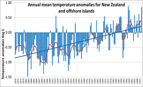
Source: Jim Salinger

During 2013 the El Niño Southern Oscillation (ENSO) was in a neutral phase, and the Interdecadal Pacific Oscillation (IPO) was negative. According to Salinger, this favours more easterlies and north easterlies when temperatures are above average. Sea surface temperatures were also well above average, especially around the South Island and to the east of the country. Jim is also expecting 2014 to be warm:

ENSO neutral conditions are expected to persist at least until winter 2014, and negative IPO conditions are very likely to persist for the remainder of 2014. These conditions are expected to bring temperatures of +0.2 to +0.6°C above average for the New Zealand region.

Across the Tasman, Australia has just recorded its warmest year since records began — with a remarkable number of heat records being set. Final figures for the annual global average temperature on main terrestrial datasets has yet to be released, but the World Meteorological Organisation expects 2013 to be 6th warmest. A few days ago the University of Alabama in Huntsville revealed that its satellite temperature dataset provisionally put 2013 in 4th place since 1979.

Denial Tango 2014

[youtube=http://www.youtube.com/watch?v=1_eNQcdwDo8&w=480]

Here’s a new recording by Aussie group Men With Day Jobs of their climate classic The Denial Tango, accompanied by a rather striking video. Men With Day Jobs are Rod Crundwell, Stafford Sanders and Kim Constable (from left to right in the pix in the video) and their new album “Deep in Denial” is due for release early next year.

I’d go with Tony Abbott, It’s just a load of crap

This round-the-world disaster is an evil greedy trap

‘Cause everybody knows the world is flat

I posted the full lyrics back in 2011

Santa Baby (and other views)

[youtube=http://www.youtube.com/watch?v=jFMyF9fDKzE&w=480]

Christmas morning has dawned sunny and warm chez Hot Topic, and there’s a pile of presents waiting to be opened. I doubt that any will be what Eartha Kitt had in mind when she recorded Santa Baby in 1953, but she makes a compelling case for Christmas largesse to be directed her way. This afternoon the weather is expected to turn to custard (or, perhaps, brandy butter) and when the rain sets in my mood may turn to match Eric Idle’s rather more ascerbic (and sweary – definitely NSFW) take on the festive season:

[youtube=http://www.youtube.com/watch?v=1H2mrV6vSPY&w=480]

And if you’re feeling at all gloomy about prospects for the human race, then I have the perfect song for you. Peter Blegvad and Andy Partridge ((From their 2012 album, Gonwards.)) assure us that worse is on the way — a truth we will all have to live with.

[youtube=http://www.youtube.com/watch?v=1qHHTqPvA1w&w=480]

Normal service will be resumed when the mince pies are finished.

Any way the wind blows: earth’s atmosphere animated

NZwindssurface

This is just brilliant: click on the image to see an animation of atmospheric flows around the planet, coded by Cameron Beccario, using forecast data from NOAA ((Data updates every three hours)). It’s mesmerising and addictive, but educational and informative too. Click on the “earth” on the bottom left of the web page, and a menu pops up that allows you to choose different layers of the atmosphere (explained on the about page). Click on 250mb to see the jet streams that guide storm tracks. This is what they looked like over New Zealand yesterday (the brighter the colour, the faster the winds).

NZwindsjetstreams

If you click and drag the globe, you can choose your viewpoint and zoom in or out. Here are the jet stream tracks above the northern hemisphere yesterday:

NHwindsjetstream

You can also play with different map projections – the row of letters in the menu – go backwards and forwards through forecasts, and click to hover above your location (the circle in brackets). Beccario was inspired by the hint.fm wind map of North America, and cut his teeth by coding a wind map for Tokyo. Wonderful stuff.

[Bo Rap with lyrics]

NZ government climate policy: look, a squirrel!

Two major new government reports on New Zealand’s emissions projections and the expected impacts of four degrees of warming on NZ agriculture were released without fanfare last Friday — the timing clearly designed to minimise media fallout from reports that highlight the paucity and ineffectiveness of current climate policy settings.

Climate change minister Tim Groser dutifully issued a press release welcoming the release of New Zealand’s Sixth National Communication under the United Nations Framework Convention on Climate Change and Kyoto Protocol, the first such report since 2009. Groser praised government policies, but failed to draw attention to the fact that his own report shows NZ emissions failing to meet the government’s targeted cuts, or that current policy settings will do little to reduce them — let alone achieve reductions by comparison with 1990 levels. This graph ((From p126 of the report)) of actual and projected net emissions out to 2030 tells the story of the Key government’s abject policy failure:

Continue reading “NZ government climate policy: look, a squirrel!”