
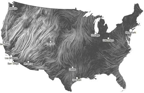
Click on the image. Wait. Watch and be mesmerised by this visualisation by Hint.fm of current wind flow over the USA. It’s a tremendous way to get a feel for the shape of the weather. Something similarly hypnotic and revealing of weather patterns is the animation of global total precipitable water (that is, atmospheric moisture content) from the Cooperative Institute for Meteorological Satellite Studies at the University of Wisonsin-Madison. I haven’t embedded it because it’s a big animation, but it’s well worth a few bits of bandwidth.
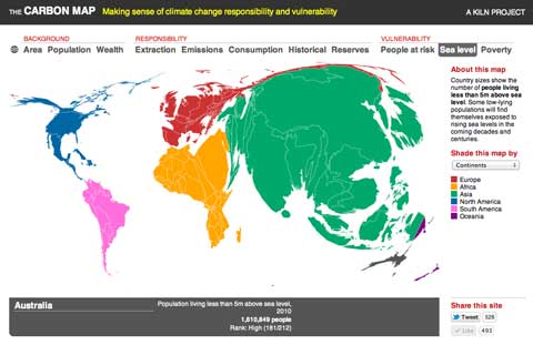
The Carbon Map is another tour de force of data visualisation — changing the shapes and sizes of countries on a global map to show how they measure on a number of indices: area, population, wealth, historic emissions, current emissions, carbon reserves and so on. The image I’ve grabbed shows the exposure of countries to sea level rise. More about the map and its creation at the Guardian.
Updated to add this amazing NASA animation of global ocean currents over 2005/7. Just look at those whorls spinning off the bottom of Africa…
[youtube]CCmTY0PKGDs[/youtube]
Hands up who spotted the best place for the turbines!?
I’d love to see one of these for our own part of the world.
Me too. They use a forecast product to create wind flow streamers, so I guess it would depend on whether similar data could be sourced from BOM or Metservice. I’ll ask…
Perpetual Ocean is amazing: I’d never have suspected the number of gyres!
Yes, as the animation panned down towards South Africa, I gave an involuntary “wow” at the gyres spinning round the cape and up to the northwest. Like Polo mints.
Ah, yes, polo mints.