 Evidence that Don Easterbrook did more than misrepresent and alter a graph in order to remove evidence of recent warming in his presentation to the recent Heartland “climate conference” is beginning to emerge. It now appears that he has been misusing one of the most important paleoclimate temperature data series, compiled from the GISP2 Greenland ice core, effectively hiding a full 100 years of recent warming. His “rebuttal” of my revelations that he had misused a graph from Global Warming Art includes this assertion:
…below is the Greenland data for the past 10,000 years (Holocene) from the published paper by Cuffy and Clow (1997), two distinguished US scientists. Note that temperatures for almost all of the past 10,000 years have been warmer than present.
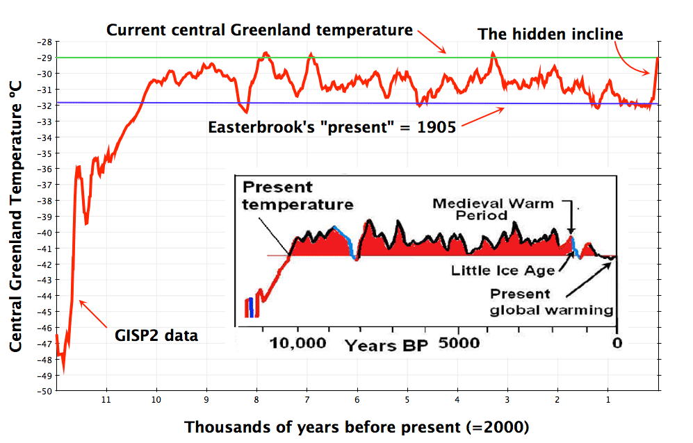
In my post yesterday, I suggested (on the basis of the notes accompanying the raw δ18O data), that the “present” Easterbrook was referring to was 1950. It now appears I was being far too generous. Thanks to a bit of detective work by MartinM in the comments to that post, the data set used by Easterbrook to draw his version of a Holocene temperature graph turns out to be the temperature series derived from the δ18O data by Richard Alley: Alley, R.B. 2004. GISP2 Ice Core Temperature and Accumulation Data. IGBP PAGES/World Data Center for Paleoclimatology
Data Contribution Series #2004-013. NOAA/NGDC Paleoclimatology Program, Boulder CO, USA (ftp download here). The most recent temperature data point in that series is 1905, and that’s the point Easterbrook labels as the present. To make his case he has to make a full century’s worth of warming disappear.
I downloaded Alley’s data and plotted it with my new favourite graphing tool. This is what it looks like:
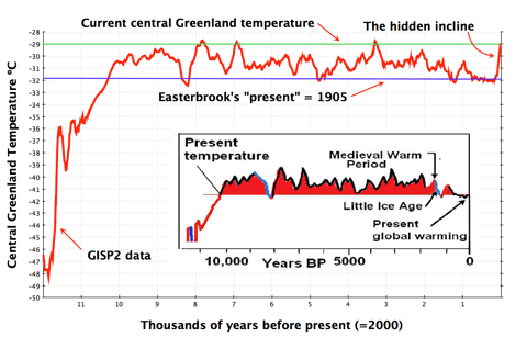
I’ve inset the graph from Easterbrook’s “rebuttal”, and added a couple of helpful lines (click for a bigger version). I think it’s pretty clear that the data behind both graphs is the same. There’s more detail in my plot, but the key features are all in the right places. I’ve added a blue line to represent Easterbrook’s “present temperature”. The green line represents an estimate of current temperatures in central Greenland. I looked at the nearest station with a 100+ year record in the GISS database (Angmagssalik), and used a Mk 1 eyeball to estimate a 2.5ºC increase over the century (I’d welcome a more accurate estimate, if anyone’s prepared to dig one up). The difference between the green and blue lines is the warming that Easterbrook wants to ignore. His statement that temperatures for almost all of the past 10,000 years have been warmer than present is shown to be complete nonsense. There are three points in the last 10,000 years when temperatures high up on the Greenland ice sheet were similar to today, but by no stretch of anyone’s imagination can it be said to have been warmer for most of the time. The incline he’s trying to hide is one of the largest and steepest in the last ten millenia…
The same temperature series also appears to form the basis for Monckton’s famous “Curry & Clow” slide from early 2009:
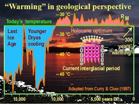
Monckton credits the wrong people, of course, but adds a helpful “300 years of warming” arrow. Like Easterbrook, he omits the last 100 years of warming. This is what he said at the time:
Seen in the geological perspective of the last 17,000 years, the 300 years of recent warming, nearly all of which must have been natural, for we could not have had any significant influence except in the past 25 years, are manifestly insignificant.
The 300 years of recent warming are of course the 300 years up to 1905. What has happened since then is manifestly significant. This sort of misdirection is par for the course for Monckton, but what about Easterbrook?
If he knowingly misrepresented 1905 as the “present” (and given that he claims to have “the entire Greenland oxygen isotope data in my computer and use it extensively to plot data” that has to be a real possibility), then he is clearly misusing the data and misleading his audience. The intellectual dishonesty involved is breathtaking. His audience may want to be mislead, but that is irrelevant. On the other hand if, as a distinguished academic with a long career studying (amongst other things) glaciers and climate change, he really doesn’t know that the data series stops in 1905, then he is demonstrating ignorance of a sort that would embarrass any student.
So where’s the investigation of this academic fraud? Where are the hordes of bloggers and journalists screaming blue murder about the manipulation of data to tell a convenient story? Here’s Joseph Bast, president of the Heartland Institute, writing about the so-called “climategate” affair last November:
Looking at how past disclosures of fraud in the global warming debate have been dismissed or ignored by the mainstream media leads me to suspect they will try to sweep this, too, under the rug. But thanks to the Internet, millions of people will be able to read the emails themselves and make up their own minds. This incident, then, will not be forgotten. The journalists who attempt to spin it away and the politicians who try to ignore it will further damage their own credibility, and perhaps see their careers shortened as a consequence.
How very true. I look forward to Bast issuing a statement apologising for being a party to Easterbrook’s fraud, for providing him with a platform to mislead and misinform, and instituting an in-depth investigation into the background of Cooling-gate. But I suspect he will be doing his best to ignore the whole affair. I leave it to the reader to decide what that does for the credibility of Bast, Heartland, and the scientists who shared a stage with Easterbrook at Heartland’s Chicago conference.
[Update 29/5: My graph revised and improved, see comment below]