
So far, I have posted on the comprehensiveness of the NZ ETS vs the Australian Clean Energy Future ETS, the Kyoto chart junk in the Report on the New Zealand Emissions Trading Scheme, and the over-supply of the New Zealand Units in 2010.
This post mixes two of these ideas; searching out bad charts and looking again at the supply side of the NZ ETS market, how many New Zealand Units were allocated for free to emitters and businesses.
The Report on the New Zealand Emissions Trading Scheme provides in Figure 5 a pie chart of the number of New Zealand Units (NZUs) surrendered by emitters.

Although the pie chart is Kaiser Fung’s least favourite type of chart, this pie chart isn’t too bad. There are a manageable number of categories; only five; and no 3-D effects. The key point is clear from the pie chart, that about two-thirds of NZUs surrendered were purchased from foresters. Also the chart follows the Ministry for the Environment usual practice of providing the original data underneath so you can do you own chart. I did a bar chart of the data, re-labelling the “Other” NZUs as “Free NZUs”. Continue reading “Charting unexplained territory in the NZ ETS Report”
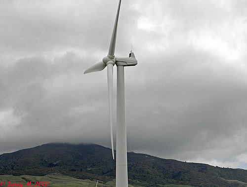 Bit by bit wind energy in New Zealand continues to make progress. It was announced today that the Environment Court has upheld resource consent for Meridian’s proposed Mill Creek wind farm in the Ohariu Valley north-west of Wellington.
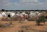 The horrifying pictures of famine in the Horn of Africa haunt us as human tragedy, and the more because they carry with them the question of whether this has something to do with climate change. Are we going to see more and more of this kind of suffering as climate change impacts begin to mount? That’s an easier question to muse than to answer with certitude, but it deserves our attention. There is every indication that poor people are going to suffer from the impacts of climate change sooner and more harshly than the rest of us. But is the Horn of Africa famine part of that?