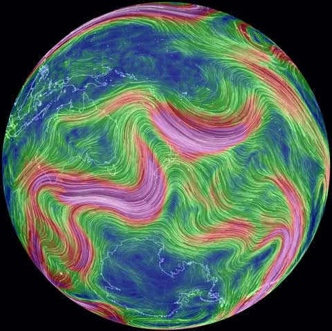
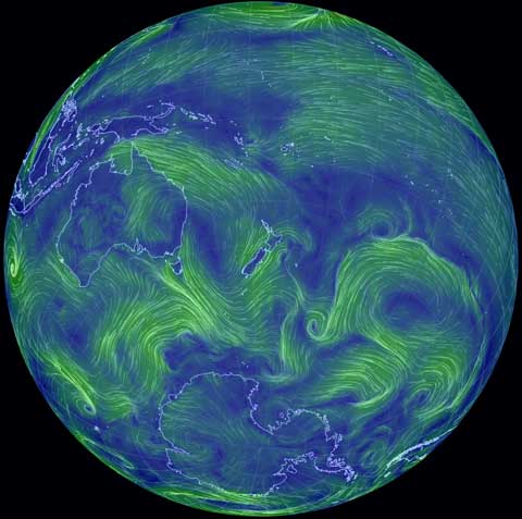
This is just brilliant: click on the image to see an animation of atmospheric flows around the planet, coded by Cameron Beccario, using forecast data from NOAA ((Data updates every three hours)). It’s mesmerising and addictive, but educational and informative too. Click on the “earth” on the bottom left of the web page, and a menu pops up that allows you to choose different layers of the atmosphere (explained on the about page). Click on 250mb to see the jet streams that guide storm tracks. This is what they looked like over New Zealand yesterday (the brighter the colour, the faster the winds).

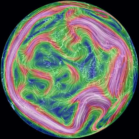
If you click and drag the globe, you can choose your viewpoint and zoom in or out. Here are the jet stream tracks above the northern hemisphere yesterday:

You can also play with different map projections – the row of letters in the menu – go backwards and forwards through forecasts, and click to hover above your location (the circle in brackets). Beccario was inspired by the hint.fm wind map of North America, and cut his teeth by coding a wind map for Tokyo. Wonderful stuff.


 My column at The Daily Blog this week is