 In early August I posted my predictions for the “sceptical” response to the record sea ice minimum. Time to call myself to account. I had planned to do my own analysis, but John Mason at Skeptical Science has done such an excellent job of ploughing through the mountains of bullshit that I asked his permission to repost his comprehensive scorecard here…
The truth is incontrovertible. Panic may resent it, ignorance may deride it, malice may distort it, but there it is. Winston Churchill, 1916.
Late summer has long been known in media circles as the Silly Season, when any old story, embellished a bit here and a bit there, is trundled out to fill column space normally occupied by the graver matters of politics and business.
In the world of climate science, late summer is of course rather more important, marking the peak of the annual sea-ice melting season of the Northern Hemisphere, and this year has been extraordinary, with the canary in the coal mine tweeting louder than ever that something is seriously amiss with the climate.
With Arctic sea-ice having reached a record low extent, area and volume, several weeks ahead of the usual end-of-melt date, the Blogosphere has been ablaze with lengthy discussions of this event and its potential and worrisome ramifications. There have also been mass-outbreaks of denial accompanied by varying degrees of silliness, as one might expect when faced with an event like a record Arctic melt-out. Many commentators could see the meltdown approaching, both in the Arctic and around parts of the Blogosphere, with Gareth Renowden over at Hot Topic speculating in early August as follows:
“When Arctic sea ice area sets a new record low in the next couple of weeks, the usual suspects will say: “You can’t trust area, sea ice extent is the only valid metric“.
When Arctic sea ice extent sets a new record low in September, the following arguments will be run in parallel:
1) There will be a frantic search for a definition of extent in which a new record was not set
2) There will be a complaint that the satellite record has been blighted by the failure of a sensor and the calibrations needed to get a new sensor in operation have corrupted the record
3) It will be claimed that it was all caused by the major Arctic storm that hit in August, and thus can’t be attributed to global warming
4) It’s cyclical — it’s all happened before, in the 1930s, and is therefore nothing unusual
5) That it’s irrelevant, because it’s not global and not happening where anyone lives so can’t possibly matter.
When the sea ice extent and area anomalies blow out to record levels in early October because of the delayed freeze-up, there will be silence.
When the re-freeze starts, and the Arctic basin is covered in ice once more (early December), Anthony Watts will report on the record rate of ice formation, calling it a “stunning recovery“.”
They go on in strange paradox, decided only to be undecided, resolved to be irresolute, adamant for drift, solid for fluidity, all-powerful to be impotent. Winston Churchill, 1936.
How closely did Gareth’s predictions above conform to the reality on the media airwaves? In this post-minimum-declared Blogosphere round-up, we take a light-hearted look.
In terms of searching for definitions of extent that failed to break the record (prediction #1), one set of data became increasingly popular in fake-sceptic circles – the IMS data. However, in clutching at this particular straw, its eager proponents overlooked a rather important point: IMS (acronym for Interactive Multisensor Snow and Ice Mapping System) is specifically intended for marine navigation, not climate monitoring, purposes. The eminently sensible idea is to map as much ice as possible as accurately as possible each day and week in support of ships (particularly DoD ships) operating in and near ice-covered waters. As a consequence, areas with too low an ice concentration to show up as extent on the NSIDC, DMI or JAXA dataplots are very sensibly counted as icy because of the potential hazard to boats not equipped to sail through such waters. In other words, IMS is an orange in amongst a basket of apples. Or (false balance alert), as IMS fan Steve Goddard put it in his so-called ‘Real Science’ blog on August 25th:
“The National Ice Center is in the business of being accurate and saving lives, while [the University of] Bremen is in the business of obtaining global warming grant money.”
That is a comment that needs no further comment from me. Meanwhile, evidently unflattered by such favouritism, the IMS dataset went on to take a nosedive all of its own and broke its record in early September:

Prediction #2 gained relatively little traction but maybe that was because prediction #3 – blaming the situation on the cyclonic windstorm that occurred in early August – was so easy to run with. But hold on a moment. The melt-rate prior to the storm was such that a record was inevitable anyway – the storm only increased melt-rates for a few days.
Furthermore, whilst such storms are indeed uncommon, the early August gale was not an unprecedented event. Who says so? Paul A. Newman, chief scientist for Atmospheric Sciences at NASA’s Goddard Space Flight Center, estimates that there have been about eight storms of similar strength during the month of August in the last 34 years of satellite records. And there’s a second factor: ice-quality (an often overlooked parameter), Claire Parkinson, a climate scientist with NASA, commented, “decades ago, a storm of the same magnitude would have been less likely to have as large an impact on the sea ice, because at that time the ice cover was thicker and more expansive.” Indeed. Two metre-thick robust pack-ice is a lot harder to disintegrate than the thin, slushy rubbish that this year’s storm had at its disposal. In summary, yes the storm was a minor factor in the magnitude by which the record was broken, but only because the ice was already in such a poor state. An impressive record minimum would have occurred, storm or no storm.
Owing to past neglect, in the face of the plainest warnings, we have entered upon a period of danger… Winston Churchill, 1936.
With regard to prediction #4, we had John Christy making claims about low minima in the late 1930s-early 1940s (the lowest minimum, in 1940, was in fact approximately 9.8 million square kilometres as opposed to 3.4 million square kilometres in 2012), although he didn’t get too specific, perhaps for obvious reasons. He was paraphrased by a Sunday Times journalist thus: “anecdotal and other evidence suggesting similar melts from 1938-43 and on other occasions”. Skeptical Science posted a detailed debunking of Christy’s claims early this September.
However, as with many such claims that appear in the media, they tend to spread, like a bad cold. The quote below is transcribed from a BBC Newsnight discussion (about Arctic sea-ice, complete with all the familiar graphics), broadcast on September 5th, in which UK Conservative MP Peter Lilley took part. As readers can see, he managed to slip in Christy’s claim, but for some reason he tagged it to the wrong end of the planet. However, he also brought in something that was not predicted by Gareth, or anyone else for that matter. Take a look:
“you have presented something which purports to be new evidence that contains nothing new, which is tendentious, not peer-reviewed, by a well known alarmist and absolute bunkum compared with the IPCC….the IPCC says sea ice is predicted to shrink in the Arctic and Antarctic under all scenarios and in some projections Arctic sea ice disappears almost entirely by the latter part of the 21st Century. They then present a graph of all the different projections and none of them show it is melting before the year 2070 on a regular basis in the summer. Now of course it used to melt from time to time in the Thirties when it was much warmer in the Antarctic. So you’ve got a very tendentious piece of presentation there by someone who’s disagreeing with the IPCC’s science.”
Whoever would have thought of that as a tactic – if events prove worse than IPCC projections, then go with what the IPCC said! What will they think of next? Especially when the self same Peter Lilley, writing in the Wall Street Journal in December 2009, opined:
“The whole U.N. Intergovernmental Panel on Climate Change process could not be better designed to institutionalize groupthink on a global scale.”
Is this the same person here? Anyway, onwards.
How about advancing the “it not being a global effect” (prediction #5) argument? One word: Antarctica. Suddenly, every fake-skeptic worth his or her salt had their eyes fixed on this gigantic ice-cube sat atop a pole-straddling continent surrounded by ocean. Note here that, in drastic contrast, the Arctic is an ocean surrounded by continents – the dynamics are completely different. To continue however: as luck would have it, there was a new paper to talk about on climate change in the West Antarctic Peninsula, largely based upon hydrogen isotope values from an important new ice-core (post and discussion at Realclimate).
The findings were also discussed at the Watts Up With That (WUWT) website. For anybody unfamiliar with the site, it endlessly trots out wild hostility to the notion that global warming, as a consequence of the reckless burning of fossil fuels, is a serious threat to mankind – despite what the science says. So, how went the discussion? Site host Anthony Watts commenced with:
“Regarding that rapid warming of 2C in the last 50 years, just remember that most weather stations in the Antarctic are near humanity, and humanity requires warmth to survive. For example [photo, annotated in purplish we assume by Watts]:

….and finished with:
The Antarctic peninsula is the most populated place in Antarctica.”
That was it, verbatim. A bit short, but there we are, left to draw our own conclusions. So what are we to make of it? Was Anthony Watts seriously trying to tell us that the West Antarctic Peninsula suffers from an Urban Heat Island effect because a few hundred scientists hang out down there? The photo he used appeared to show a temporary field camp, something akin to the Everest Base Camp and hardly urban in nature. Whereabouts was it? And what does it have to do with a long-term temperature reconstruction based upon hydrogen isotopes from an ice-core? All very mysterious.
However, following the usual stream of comments (general and unending theme = ‘those darned warmistas are at it again’), an important clarification was posted, which we reproduce here in full:
Dear WUWT
I guess I owe the world a humble apology for personally contributing so much to the urban heat island in Antarctica, and hence to misinterpreted climate records.
The badly sited meteorological screen in your photo is at an Australian summer camp in the Northern Prince Charles Mountains, near Mt Jacklyn – in the background. Temperatures measured here were for local information of pilots and field parties only – it is useful to have an idea of how many layers of clothes to put on before exiting your Antarctic shelter. Temperatures here were only measured for less than 2 months over a couple of seasons and have NEVER been used for any climate record.
This photo was taken in the 1988/89 austral summer when I, and a colleague Andy, lived in the UNHEATED shelter nearest to the meteorological station. I didn’t realise that I was so hot that my body heat could influence temperatures measured on the Antarctic Peninsula, thousands of kilometres away. It must have been Andy!!!
Ian
A little geographical research shows the location of this interesting area of East Antarctica:

Thanks to Ian for clearing that one up!
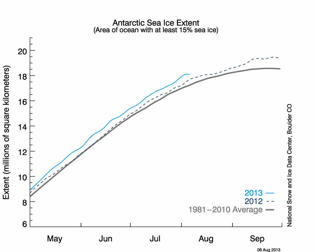
It would be unfair to omit the fact that Antarctic sea-ice extent has been high, impressively so if certain blogs are to be believed. Beware! During the current, about-to-end Southern Hemisphere winter, it peaked at about 19.4 million km2, after a minimum of about 5 million last summer. Some people seem easily impressed. The 1979-2000 average maximum is around 18.5 million km2. In the Arctic, the maximum has remained this past 30 years at 13.5 million to 14.8 million km2, but the minimum this year is 3.4 million km2, against a 1979-2000 average of approximately 6.75 million km2. That seems to me a rather more substantial figure. It has involved a meltdown of over ten million square kilometres of sea-ice, leaving just three and a half million behind. (addendum 22/09/12: Tamino has covered the Arctic-Antarctic difference in far more detail here.)
So – back to the Northern Hemisphere, and coincidentally, the declaration of a record Arctic sea-ice extent (August 26th) came in a week where the American Meteorological Society released a statement about climate change on August 27th, in which the concluding remarks sum up the situation as follows:
There is unequivocal evidence that Earth’s lower atmosphere, ocean, and land surface are warming; sea level is rising; and snow cover, mountain glaciers, and Arctic sea ice are shrinking. The dominant cause of the warming since the 1950s is human activities.
Watts’ take on that?
“Seems almost a planned effort this week, Sea Ice, [Hurricane] Isaac, and now the AMS statement.”
As Scotty of Star Trek fame would have said – ‘Ye cannae change the laws of physics.’
How about the other arguments that Gareth missed? One I did hear reported over at Neven’s Arctic sea-ice blog was the claim that 450 more cubic kilometers of ice volume went away in 2010 (18,974 km3) than have so far this year (18,523km3), meaning – wait for it – that the ice is in “recovery”. Now then. If I were to melt a whole ice-cube in 2011 and then melt a half ice-cube in 2012 then I’d have melted less ice in 2012 but still have ended up with nothing. Fail.
Another one getting an airing runs along these lines:
“The Earth’s surface area is about 510 million square kilometres. The Arctic ice extent at it’s [sic] minimum is currently around 3 million square kilometres. So we’re talking about 0.6% of the area.”
Anyone spot the flaws with this? Firstly, Arctic sea-ice is a feature specific to water. Secondly, it’s not the extent after melting, but before that is important, because it is the difference between the two that represents the amount of albedo-loss over the planet’s waters, albedo being the proportion of incoming solar energy that is reflected by a surface (as opposed to being absorbed) during, in this case, the Arctic summer.
The surface area of Earth that is water-covered is approximately 361,132,000 square kilometres. Last March, the Arctic sea-ice maximum was approximately 14,440,000 square kilometres. Doing the maths:
(14,440,000/361,132,000) x 100 = 3.998%
So that’s almost 4% of the surface area of Earth’s water over which the albedo value can undergo dramatic change. Albedo is expressed in values between 0 and 1; snow-covered sea-ice has an albedo of 0.9, bare sea ice has an albedo of 0.5 and open sea water has an albedo of 0.06. That means that snow-covered sea-ice only lets 10% of incoming solar radiation through into the water; bare sea-ice lets about half through but open water lets a whopping 94% of incoming solar energy in. This year, the drop in Arctic sea-ice extent has been from a high of 14.44 million sq km to a low of 3.4 million sq km – a loss of over 75% of that useful high-albedo area. So forget about 0.6% – it is a meaningless figure!
But perhaps the last word can be awarded to Dr Judith Curry of the blog Climate etc, in an interview with Yale Environment 360 on August 30th:
“I don’t think this apparent record sea ice minimum is of particular significance in our understanding of climate variability and change of Arctic sea ice.”
What a strange choice of words. Apparent record? The National Snow and Ice Data Center (and these guys know what they’re talking about – it’s their job) had confirmed the record had gone in a press release four days previously. Eye off the ball, maybe? Who knows? For now, let’s use a couple of images to explore this choice of vocabulary:

L: an ‘apparent’ tornado; R: an ‘apparent’ hurricane.
Now, can anybody tell me what is ‘apparent’ about this sea ice minimum record (below)?

I’d say that was in-your face, don’t mess with me, full-on record meltdown, myself.
Now that the minimum has passed we enter the long darkness of the Arctic winter. The sea surface will once again start to refreeze. There should be a final maximum extent by mid-March 2013 of, as consistently recorded over recent decades, 13.5 to 14.8 million square kilometres, at least 10 million km2 of which will be thin, melt-prone first-year sea-ice. As to next year’s melt season? In this particular case, the models have struggled – they have underestimated the meltdown, as the graph below, borrowed from Neven’s Arctic sea-ice blog, demonstrates. However, NSIDC Arctic specialist, Dr Julienne Stroeve, in a recent Guardian interview, commented:
“We can expect more summers like 2012 as the ice cover continues to thin. The loss of summer sea ice has led to unusual warming of the Arctic atmosphere, that in turn impacts weather patterns in the northern hemisphere, that can result in persistent extreme weather such as droughts, heatwaves and flooding.”

The era of procrastination, of half measures, of soothing and baffling expedients, of delays, is coming to its close. In its place we are entering a period of consequences. Winston Churchill, 1936.
To conclude, for most of the media world, late summer is the silly season. Unfortunately, in some parts of the blogosphere, it appears to have become a permanent state of affairs! But there’s one final prediction of Gareth’s remaining to be confirmed. Will a ‘Stunning Recovery’ be widely announced as we head into winter 2012-13 and the sea refreezes, as it is supposed to? For the answer to that, only time will tell.

The mental disconnect of the denial circus is sickening. The age of silly is indeed upon us, where thanks to the internet enabled power to self-publish any old yarn to the masses, we are confronted with ill educated but vociferous individuals who would have mercifully remained silent before.
The acts of activism to deny climate change seem just as sickening as the act of the Texas cop who shot a wheelchair bound double amputee wielding a pen for failing to do as commanded….
When will the communal intellect emerge to get us out of this mess?
Does anyone know where you could find a graph or the data similar to the second last one in this post (you are here 2012 in bright red) for the Antarctic? My guess is that the range of variability for summer Antarctic extent is still within the range of model projects. Because though summer Antarctic sea ice extent has risen the rise has been smaller, plus the projections for Antarctic summer sea ice loss were less than those for the Arctic.
Kevin
Answer: Yes. Already.
You really could not make it up…
For a sampling of the forces of dumb and dumber in the age of silly have a scan of the article and comments at the American ‘Thinker’….
Definitely an oxymoron.
Apart from Microsoft, HP, Yahoo, Google, NASA, Intel, nuclear power, putting a man on the moon, what have the Americans done for us?
I wouldn’t have thought that that list represented the height of human endeavour by any means. Microsoft’s contribution was to market a substandard operating system – QDOS short for “quick and dirty operating system”, and a seriously flawed word processor “word”. HP used technology developed elsewhere, Google whose infringement on personal privacy is probably only exceeded by the GCSB, NASA – what has spending trillions of dollars on sending a man into space got to do with the relief of human suffering?, intel? well most of that is manufactured elsewhere, and nuclear power was mainly an international effort – read the “manhatten story” if you really want to know the truth.
AndyS, you got the “oxymoron” attribute attached to the wrong neurons up there….. The oxymoron comment was quite fittingly labeling the blog site called “American Thinker” and not Americans as such…. at least that’s my interpretation of the matter…
…and we just invited them onto our shores 🙁
http://www.stuff.co.nz/national/politics/7719842/US-keen-to-station-troops-in-NZ-Panetta
There is no way in Hell that we will avoid a runaway climate with so many idiots such as these voting for the twit.
No wonder that bloke in the picture looks constipated…
Loved this one:
A week’s a long time in politics, and all that, but at this stage you can almost hear the rest of the globe’s breath being held ready for the sigh of relief when The Stupid finally does nothing of the sort in November. Mr 47% really only had the fact that he was the only candidate no-one hated enough to turf going for him in the first place, and his sidekick is like some scary hybrid between Uriah Heep, a replicant Evangelical huckster, and Gomer Pyle…
I doubt employees at Microsoft, NASA, et. al. read American Thinker.
Indeed. Several prominent employees of NASA are doubtlessly routinely slandered at this amusingly titled site.
Speaking of American Thinkers.
We await his views regarding screen-doors and submarines with considerable interest…
Ha! I think the Republican candidates should always be given a special plane with an opening window next to the seat of the candidate…
This would solve some of America’s most pressing current concerns… 😉
I hope somebody puts this into the GOP presidential candidates bloopers collection.
… scanning the 1400++ comments on the Thinker on this one it seems that finally the Thinker does its thing…
Well, NASA don’t claim that it can’t be attributed to global warming, but they do have a nice visualisation showing the storm that played a fairly major part in the ice break up (according to them)
Another good visualisation
http://climatecrocks.com/2012/09/24/are-we-in-a-new-climate-state-the-new-arctic-ice-minimum-video/comment-page-1/
One of his most impressive videos, I’d say.
It is a very impressive video as it managed to include the NASA visualisation i provided plus some mention of the AO and segue that into a final political and fact-free comment from Dr Jennifer Francis with a scary fade to monochrome
That would be “fact-free” in so far as Andy doesn’t agree with the statement of an atmospheric physicist working on the problem. In other words, another “content free” comment…
When Atmospheric physicists make largely political comments (in monochrome) I generally start to lose interest
She didn’t actually make any statement of any value, other than “the climate is changing”, which is kind of obvious really
The other bits were interesting, like the visualisation of the storm and the ice thinning and the ice aging stuff
Oh and the mention of the AO with the handy explanation that this stands for “Arctic Oscillation”
And note the persistent inability to notice the volume issue, as animated in a very, very easy to comprehend manner in the video.
You’d love ’em making ‘political comments’ if by some remote chance they ever uttered a statement you agreed with, though…
Consult a volume chart some time, andy.
Speaking of such – who’s the gang that couldn’t shoot straight? 😉
Yes of course Bill,
Yawns
Notice how andy finds fact “boring” – far more interested in flights of fantasy and fiction.
I don’t find facts boring. I find implications that I will approve of political statements from physicists OK if they fit with my world view, boring, because they are unfounded
When I proposed a while back that the record minimum was triggered by 3 weeks of activity – probably a weather event – that gave a sudden dip in the ice level, it was treated with derision and scorn. Note also that I didn’t deny that there has been a steady decline in the ice volume over the last few decades (which incidentally correlates well with AMO)
Now NASA have vindicated my statement. That must be very boring for you too
Nonsense, Andy. While that storm was a mere long range forecast, ice watchers were speculating that it might have a dramatic impact – and it might astonish you to learn that nobody has ever suggested it didn’t. However, I most certainly did predict that “sceptics” might attempt to blame the new record entirely on that storm, and you (and Treadgold et al) are proving me correct (see #3 in the post above).
Two uncomfortable facts for you: the storm itself was made worse because of the recent retreat in ice coverage (storms thrive on open oceans and strong temperature contrasts), and the ice was already thin before the storm, and heading well down into record territory. The August storm certainly helped set the new record, but the new record was not caused by the storm alone.
It’s an amusing – and rather a horrifying – process watching someone lock themselves away, step by step, rejection by rejection, substitution by substitution, into the lost world of epistemic closure.
More on the impact of those long-term weather changes in the far north that that one storm last month has miraculously caused, at least according to those who inhabit the intellectual Land of the Lost.
I notice the meme ‘Scientists shouldn’t be pointing out this is a problem, that’s not objective, that isn’t’ is currently big among the Denialati, which is a backhanded acknowledgement that they’ve lost the argument along with the plot.
On the upside of Gareth’s predictions: The age of the blimp is dawning already! 😉
I’m not sure using up precious helium is a good idea:
http://www.guardian.co.uk/science/2012/mar/18/helium-party-balloons-squandered
That’s why my blimp uses hydrogen active buoyancy control… 😉 Download the free samples (Kindle, epub) and check out Thunderbird’s tech specs.