
It pays to beware of leaving hostages to fortune: saying or doing something that might cause you some embarrassment in the future. There’s a very fine example in this recent blog post by Ian Wishart, titled “Top 10 global warming myths exposed“. It takes the form of a piece Wishart has submitted to the Coromandel Chronicle, taking exception to a column by Thomas Everth [PDF]. He begins:
In a blatant effort to mislead and scare your readers, Green blogger Thomas Everth makes more errors in the first 200 words of his recent global warming diatribe than I have made in my last three books totalling around 400,000 words.
As hostages go, that’s pretty impressive. Wishart proceeds to find fault with ten of Everth’s opening points, but does he make a few mistakes of his own in the process? I’m going to take a long, hard look: is that hostage feeling lucky?
Myth number one:
[quoting Everth]“One would think that in the face of: visibly vanishing Arctic ice Caps…”
[Wishart’s response] In fact, after hitting a record low extent in 2007 caused mainly by wind patterns blowing ice into warmer waters, Arctic sea ice has grown significantly in coverage since 2007, even exceeding the 30 year average it is measured against. “Visibly vanishing”? I don’t think so.
That piqued my curiosity. Has sea ice “coverage” exceeded “the 30 year average” recently? I had a look at the (new, improved) graph at Cryosphere Today. Nope, the area anomaly has been below the long term average over the last two years. What about ice extent? The National Snow and Ice Data Centre in the US has just issued its 2009 year end summary, and helpfully provides this graph (Click the image for a bigger version):
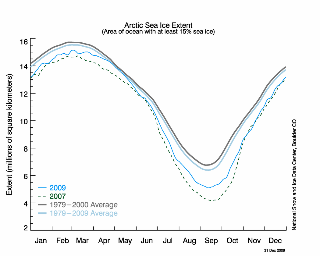
As you can see, in early May 2009 the ice extent just bumped under the ’79-2000 average (grey line), but certainly didn’t exceed it. Since then it’s been well below average, as it was prior to May. The NSIDC also provides an average line (the pale blue one) based on the full 79-09 data. It runs below the 79-2000 average because it includes the low ice levels of recent years, and May’s extent did bump slightly over that line. So: for a few days in May, Arctic ice extent was above the 30 year average. Wishart’s little factoid is technically correct, but it’s a prime example of cherry picking — choosing a fact that tells the story you want, rather than providing the full picture. And the big picture in this case is easy to see in the graph. After flirting with average in spring (thanks to a cold April), ice extent then dropped rapidly, and despite a cool summer reached the third lowest minimum in the record. It’s been bumping along the lowest recorded since — and might even have set new record negative anomalies in recent months. Here’s how the NSIDC sums up 2009:
Despite the cool summer, the ice remained thin and vulnerable at the sea ice minimum, with little of the older, thicker ice that used to characterize much of the Arctic. Recently published research by Barber and colleagues shows that the ice cover was even more fragile at the end of the melt season than satellite data indicated, with regions of the Beaufort and Chukchi Seas covered by small, rotten ice floes.
You can see David Barber talking about that rotten ice here. So: no new record lows, but no real recovery, and the trend in every month of the year remains strongly downwards.
Number two:
[Everth] “…the break up of huge Antarctic ice shelves,”
[Wishart] Actually, the “huge” ice shelves amount to less than a fraction of one percent of Antarctica’s area, and they’re in an area hit by warmer ocean currents than the rest of the ice continent. Furthermore, a string of recent scientific studies show the area has been even warmer in the past one thousand years than it currently is, naturally. Hardly the stuff of nightmares.
Actually, there are about 1.5 million km2 of ice shelves fringing Antarctica, and in the last 50 years the Antarctic Peninsula alone has lost over 40,000 km2 – a little more than 2.5% of the total for the continent. Antarctica’s a big place (14 million km2), so if you compare apples (ice shelves) with oranges (continental ice sheets) you can come up with a very small — and very meaningless — number. For a fuller perspective, the NSIDC has an excellent page on ice shelves here.
Wishart also claims that “a string of recent studies show the area has been even warmer in the past one thousand years than it currently is”. It appears likely that Ian’s “string” is one paper he’s quoted before, about possible elephant seal colonies in the Ross Sea (Hall et al, PNAS, 2006 [PDF]), and he was given the relevant context (that it doesn’t necessarily imply increased temperatures at the time) by Prof Tim Naish on his own blog last year. He seems to have forgotten that… The big picture? Take a read of Chapter 3, Antarctic climate and environment history in the pre-instrumental period from the SCAR report [PDF]. A lot more nuanced, a lot more interesting than Wishart’s cartoon portrayal, and not much sign of warmth in the last 1,000 years — until recently.
Number three:
[Everth] “…methane bubbling melting permafrost,”
[Wishart] This is one of the favourite scare stories of Everth and some others, particularly those who frequent the local Chicken Little website Hot Topic, run by a South Island truffle grower. I was therefore amused when NIWA recently rubbished the idea of a major threat from methane hydrates. They had to rubbish it, because scientific data suggests the methane stores are actually highly stable. The permafrost was 30% warmer in the 1930s than it is now (naturally, again), but we did not all vanish in a methane explosion.
Didn’t take him long to get to truffles… 😉 I am mystified by his comment about NIWA “rubbishing” the threat from methane hydrates. NIWA’s release of the latest methane data didn’t mention hydrates at all, just arctic warming as one potential source of the recent increase. To be fair to Wishart, many of the largest deposits of methane hydrates are thought unlikely to bubble up any time soon — they are on deeper continental shelves where the combination of high pressure and low temperature keeps them stable. It’s the Arctic sea floor methane hydrates that are causing concern. The shallow seas north of Siberia have enough methane beneath them to cause a lot of warming if rapidly released, and there’s plenty of evidence of large plumes of bubbles, as I noted in my last post. A scare story, or a genuinely scary prospect? The evidence is what the evidence is, not what Wishart might want it to be — you can make up your own mind.
Wishart’s claim that “the permafrost was 30% warmer in the 1930s” is also mystifying. What permafrost, where? Extensive monitoring of permafrost temperatures has really only been going on since the 1950s, though some Alaskan records stretch back to the 1920s. The section on permafrost in the IPCC’s 4th report (WG1, section 4.7, PDF) provides no support for his contention.
Number four:
[Everth] “…vanishing glaciers,”
[Wishart] As the US National Science Foundation and others have well documented, glaciers and ice sheets have much longer response times (thermal lag) to warming or cooling than you’d think. Big glaciers, for example, can take up to a thousand years to show serious effects from a warmer climate, and big ice sheets can take up to tens of thousands of years, according to the US NSF (details in the book Air Con). All of which means that the melting we are seeing now is a delayed reaction to warming that took place between a hundred and a thousand years ago. I would remind readers that the warming that took place back then was entirely natural, as the knights of old were not driving SUVs.
This is classic Wishart. Here he assumes that glacier response time is equivalent to “thermal lag” — a concept that pops up regularly in Air Con. His statement that “the melting we are seeing now is a delayed reaction to warming that took place between a hundred and a thousand years ago” is nonsense. Here’s a simple explanation of why…
The vital statistic for any glacier is its mass balance: the amount of ice it contains, and how that changes. The quantity of ice in a glacier is determined by the amount of ice that melts during the year (or for glaciers that terminate at sea or in lakes, lost as calving icebergs), balanced against the amount of new ice that forms at the source of the glacier — the névé or snow field at its highest point. If the amount of ice loss is smaller than the ice gain, then the mass balance is positive and the glacier grows. If melt exceeds replenishment, the glacier shrinks. A glacier’s mass can grow one year and shrink the next, based purely on the local weather it experiences (see NIWA’s graph for ice mass in the Southern Alps, to see how NZ’s total ice mass changes from year to year). No “thermal lag” involved…
A glacier has two kinds of “response time”. The first is the length of time it takes a glacier to respond to a change in climate — to achieve a new equilibrium with its local climate. If the local climate cools (or snowfall increases) then a glacier’s mass balance will be positive and the glacier will grow until the (lower) melting (or calving) zone is large enough to balance out the increased ice input from snowfall. When that happens, the glacier will stop growing and will stabilise. It will have responded to the change in climate. If the climate change — lets say warming, for the sake of argument — continues long enough, the glacier may never get back into equilibrium, and will disappear. This is true for the bulk of the Tasman Glacier: it’s already certain to retreat at least as far as the Ball Hut, leaving a new deep lake behind. Whether it can stabilise at a new much smaller size remains to be seen. The second kind of response time is the time it takes for changes at the snowfield at the top to work their way down to the terminus of the the glacier. For a small glacier, this response time can be short — 5-7 years for NZ’s Franz Josef and Fox glaciers for instance — but for large ice sheets, the time can be thousands of years or more.
Wishart’s error here is a big one — a very basic misunderstanding of the meaning of “response time”. He appears to think it means that the ice somehow has to wait for a period before it can start melting — he calls it “thermal lag”. This is, not to put too fine a point on it, complete rubbish. If the climate warms, ice starts melting straight away and the glacier starts losing mass. No lag. No heat mysteriously stored away for hundred or thousands of years before making itself felt. Current melting is not a “delayed reaction” to events a long time ago, it’s a direct response to current weather and climate change as it happens.
[For more detail on glaciers, check out this article at the NIWA web site. It has a great opening line… Then have a look at Mauri Pelto’s From A Glaciers Perspective blog for examples, and check out this recent NZ report on the Tasman Glacier (discussed at Mauri’s blog, too).]
Number five:
[Everth] “…heat waves,”
[Wishart] Everth conveniently forgets to include the balancing factor for heatwaves: cold spells. As many of your readers are now aware, the Northern Hemisphere has been hit by another brutal icy winter, even bigger than last year’s record breaker. In December alone nearly 900 snowfall records in US towns and cities were broken or tied, and temperatures were 15 degrees below average in some areas. As a matter of factual record, more people die from the cold than in heat waves.
Here’s a balancing picture of this northern hemisphere winter:
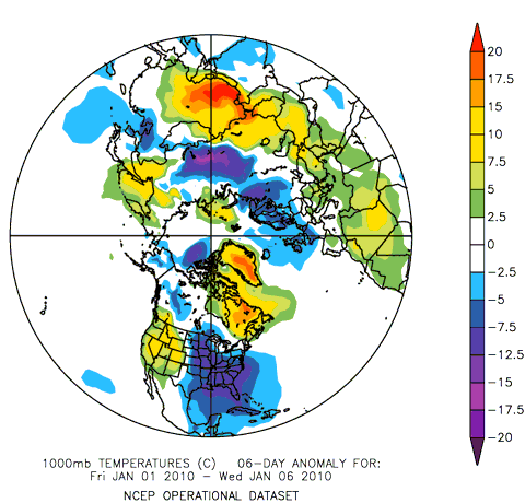
This is an NCEP/ESRL plot of temperature anomalies over the northern hemisphere for the first six days of January. Big blue blobs for cold weather in the eastern USA, northwestern Europe and central Russia (where Europe’s cold air is coming from). The yellow and red blobs are warm anomalies, and at a rough eyeball guess, I’d say they at least balance out the cold. We’ll know when the winter analysis is done… To give you some idea of the size of those warm anomalies, Goose Bay in Labrador is normally -25ºC at this time of year. A couple of days ago temperatures were hovering round 0ºC — a full 25 degrees warmer than normal!
As for temperature records in the US, here’s what a recent study at the National Center for Atmospheric Research in the US shows:
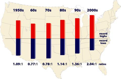
This graphic shows the ratio of of record daily highs and lows for about 1,800 US weather stations for each decade of the last 60 years. During the slight cooling of the 60s and 70s there were more new cold records than new hot ones, but in the last ten years there have been just over twice as many new hot records as cold ones — a clear signal of a warming climate.
[For a discussion of the atmospheric drivers of the current cold winter patterns up North, check out this post by Jeff Masters, and there’s a beautiful image of a completely snow-covered British Isles at NASA’s Earth Observatory.]
Number six:
[Everth] “…record bush fires”
[Wishart] Your correspondent refers to the Australian bush fires, but readers of Air Con who’ve seen the chapter on those fires will recall that Australian temperatures are not fuelled by CO2 but by hot seasonal winds blown in from the central desert. (same problem in California and vulnerable parts of the US) It is a matter of factual record, again, that last summer’s ‘record’ temperatures were no different to those measured in the great fire of 1851 – a blaze ten times larger than the 2009 killer fires in Victoria. The death toll in Victoria, incidentally, was far higher than 1851 because of a daft resource management bylaw introduced by Green councillors that prevented homeowners from cutting down vegetation close to their homes. Hence, when the blazes hit, houses burnt to the ground.
Australian temperatures have increased by 0.9ºC over the last 50 years. Heat extremes have increased while cold extremes have reduced, and there is little doubt that increasing heat has contributed to fire danger. Here’s what the latest CSIRO/BOM climate change update [PDF] has to say about bush fires:
The pattern of recent extreme fire danger is part of a broader shift towards more severe fire seasons in central Victoria. It is very likely that climate change has increased the likelihood of extreme fire danger in south-east Australia. The climatic conditions experienced in Victoria on February 7 2009 were unprecedented. The area north-east of Melbourne had experienced a 12-year drought before the fires, as well as record high temperatures, a record
heat wave two weeks earlier, record low rainfall and record low
humidity. The area was also experiencing an unprecedented sequence of days without rain.
The frequency of extreme heat waves has also markedly increased. You can read about that in the Aussie climate change update, or for more detail of the truly unprecedented sequence of extreme heat events in South Australia, read what Adelaide climate scientist Barry Brooke had to say last November:
Consider that in prior to 2008, the record length for an Adelaide heat wave in any month was 8 days (all occurring in summer). Now, in the space of less than 2 years, we’ve had a 15 day event in Mar 2008 (a 1 in 3000 year event), a 9 day sequence in Jan/Feb 2009 (which included 8 days above 40°C and 13 consecutive days above 33°C), and now, another 8 day event in Nov 2009. How unusual is this? There have been 6 previous heat waves that lasted 8 days, many more of 7 days, more still of 6, and so on — the return time is logarithmically related to it’s length. Given these data, and the fact that the latest spring event has equaled previous all-time summer records(!), and the alarm bells should rightly be ringing. Statistically speaking, it’s astronomically unlikely that such a sequence of rare heat waves would occur by chance, if the climate wasn’t warming. But of course, it is.
It’s also worth reading the Aussie BOM 2009 summary for more context.
Wishart wants us to believe that the bush fires were caused by weather (true), and that the weather wasn’t unprecedented (not true). Everth points to bush fires as symptoms of climate change, and the Aussie data supports that point.
Number seven:
[Everth] “…the last decade being the hottest on record ever,”
[Wishart] Sounds impressive, except that technically ‘ever’ means only in the past 30 years, which is how long we’ve had satellite coverage of the planet. So really what Thomas is saying is that the last decade was the hottest of the last three decades. But as he didn’t tell you, there’s been no statistically significant warming at all over the past ten years, which is why one of the world’s top climate scientists, Kevin Trenberth got so hot under the collar in the Climategate emails where he wrote:
“The fact is that we can’t account for the lack of warming at the moment and it is a travesty that we can’t”.
Green blogger and lobbyist Thomas Everth says one thing, climate scientist says, admittedly through gritted teeth, something quite different in implication.
Oh dear. The misconceptions and misdirections in this little section alone are enough to merit a whole post to themselves, but I’ll have a go at a precis.
Wishart makes the astonishing assertion that we can only rely on the temperature record since the advent of satellite measurements. This will be news to the meteorological community, who have been making direct measurements of temperature with very accurate thermometers for 150 years or more. Temperature measurements from satellites are anything but direct. Roy Spencer has recently blogged on the process, explaining how the satellite instruments work, and how the data has to be processed to extract a temperature signal. Fascinating, undoubtedly, but he also points out:
Because of various radiometer-related and antenna-related factors, the absolute accuracy of the calibrated Earth-viewing temperatures are probably not much better than 1 deg. C.
Direct thermometer measurements can do far better than that. Of course, absolute accuracy is not that important when you’re looking at trends over time, provided that the instruments are consistent (that is, always err by the same amount). When we compare the satellites with the ground-based thermometer record we find that they show the same picture — nobody would trust the satellites if the disparities were huge (that happened in the 90s, and a lot of effort went into correcting the satellite data) — so we can be confident that the pre-satellite record is at least as reliable as the satellite data. On that basis, Everth is correct, because the World Meteorological Organisation has already indicated that the last decade will be the warmest in the long term (150 year) record. Wishart’s attempt to limit the record to 30 years? Epic fail.
Next: no statistically significant warming for ten years? We already know that the average of the ten years 2000-09 was warmer than the 1990-99 average. Warming continues. The accuracy of Wishart’s claim rests on the definition of “statistical significance”. I make no claims to being a statistician (and neither does Wishart, as far as I know), so I defer to Tamino’s analysis at Open Mind, where a professional statistician and expert in time series analysis shows that you need 15 years of GISS temperature data to be confident that trend is greater than zero. Here’s Tamino’s conclusion:
That does not mean that there’s been no warming trend in those 15 years — or in the last 10, or 9, or 8, or 7, or 6 years, or three and a half days. It only means that the trend cannot be established with statistical signficance. Of course, it’s another common denialist theme that “there’s been no warming.” This too is a fool’s argument; any such claims are only statements about the noise, not about the trend. It’s the trend that matters, and is cause for great concern, and there’s no evidence at all that the trend has reversed, or even slowed.
The Trenberth quote? Taken out of context (explained here). Trenberth was not admitting anything through gritted teeth, he was bemoaning the lack of adequate data to fully account for all the elements in the planetary heat budget.
So: Everth’s statement is correct, and Wishart’s attempt to suggest otherwise is unconvincing.
Number eight:
[Everth]“…new records for ocean temperatures broken in 2009,”
[Wishart] Well, there have been big lows in the past 24 months compared with the past couple of decades as well, so on balance, not such a big deal. As Thomas would be the first to acknowledge, short term fluctuations are not hugely meaningful. The only reason ocean temperatures were higher this year was because of the naturally occurring El Nino. Much more detail on this topic can be found in Air Con.
Ah, so short term fluctuations are not meaningful here, but a cold snap in North America this winter is? Wishart suggests that this year’s record sea surface temperatures (see here for details) were caused by El Nino. In one sense, that’s true: El Nino always brings warm SSTs to the Pacific. However, El Nino alone can’t explain the record high temperatures. As with the Aussie heatwaves and US temperature records, it’s the underlying warming that tips the odds towards new record highs. For that reason, many people expect 2010 to set a new global temperature record — a warm event overlaid on the underlying warming trend makes the odds at least reasonable.
Number nine:
[Everth]“…ocean acidity increasing fast”
[Wishart] Not technically true either. The oceans are alkaline. What is happening is a tiny decline in alkalinity as the result of higher CO2 levels, but there is not actually enough surplus CO2 around at present to physically turn the oceans acid. What is probably much more significant, however, is a new peer reviewed study in the journal Science which shows overfishing could be a far bigger reason for declining alkalinity in the oceans.
Technically, what Everth says is exactly true. Ocean waters remain on the alkaline side of neutral, but their acidity is increasing rapidly. Wishart’s “tiny decline” – a 0.1 unit decrease in pH doesn’t sound like much, after all — is actually a 30% increase in hydrogen ion concentration, because pH is a logarithmic scale. That’s a huge change, happening fast in geological terms, and there’s more than enough CO2 in the atmosphere now, and expected to be emitted over the next few decades to cause huge problems for oceanic ecosystems. Here’s what a recent introductory guide for policy makers prepared by EPOCA (the European Project on Ocean Acidification) has to say [PDF here]:
Ocean acidity has increased by 30% since the beginning of the Industrial Revolution and the rate of acidification will accelerate in the coming decades. This rate of change, to the best of our knowledge, is many times faster than anything previously experienced over the last 55 million years.
The significance of overfishing… is much more complex than Wishart suggests. Check out the original press release and abstract to see why what he says is a remarkable overstatement.
Number ten:
[Everth] “With CO2 concentrations shooting up to pass 400ppm soon, we have entered a territory of Earth’s atmospheric composition not seen for millions of years – CO2 having stayed at or below 280 ppm during those millions of years.”
[Wishart] Er, not strictly true either. Recent studies have found global warming scientists ‘cherry picked’ only the CO2 readings from the past that suited their low 280ppm starting point. In fact, readings over the last 200 years suggest CO2 levels have averaged around 335ppm, and as high as 500ppm in some areas. Why is this significant? Because if you choose a low starting point, say 280, and you can show we’ve risen to 380 today, then that’s a big rise in CO2 levels. But if the starting point was really 335, then the increase is nowhere near as big, and that would be “inconvenient” for the human impact on global warming argument that Thomas is running.
Both Everth and Wishart are “strictly” wrong, but Everth’s mistake is the smaller. CO2 levels have exceeded 280ppm during recent interglacials – up to around 300ppm in the most recent, for instance. The rest of what he says is quite correct. On the other hand, Wishart wants us to believe, apparently on the basis of an infamous “paper” by EG Beck (so ludicrous that it’s been disowned by “serious” sceptics), that recent CO2 levels may be much more volatile than we think. Beck’s big mistake? To assume that all CO2 measurements were equally valid, wherever and whenever they were taken. Wishart’s? To swallow Beck whole, and regurgitate it in public.
For a man who claims to have made no mistakes in three books and 400,000 words, Wishart’s error rate in this latest piece is astounding. Perhaps his most telling mistake concerns the “thermal lag” he says operates in glacier response to warming. If he had troubled himself with a little study, perhaps spoken to a few glaciologists, he would have seen that his “lag” was a physical impossibility. Perhaps now that his mistake has been pointed out he’ll correct the pages in Air Con where he misconstrues glacier response times (pps 96/7/8) for the next edition. But I won’t hold my breath.
Thomas Everth’s presentation of the facts of climate change and its impacts is far less misleading than Wishart’s. In every one of the ten “myths” Wishart tries to expose, he gets something wrong — cherry picking facts to suit his argument, ignoring the balance of evidence, relying on “studies” that have long been shown to be rubbish. In one respect, however, Wishart has done me a service. In researching this examination of his arguments I’ve had to dig around in the literature, and exchange emails with a few experts to check my understanding. I’ve done some learning, and it’s been fun. It could also be a teaching moment, but I doubt the student it might help the most will be inclined to benefit.
And the hostage Wishart left dangling? On the evidence, it doesn’t look like he’s going to be rescued any time soon.
IMHO, Ian Wishart is beyond a joke – a religious fundamentalist with no scientific training whatsoever, he denies physical climatological evidence whilst, at the same time, proselytising fantasies of imaginary sky gods and miracles.
Well done, Gareth, for exposing this charlatan yet again.
Wishart is beyond contempt.
Imagine the reaction.
“Truffle, truffle, truffle, took me out of context, still can’t get it right, didn’t read the book, it’s all there on page blah, blah, blah, complete with peer reviewed cites. Al gore is fat and makes lot’s of money blah, blah, blah. See I was right all along. Truffle, truffle, truffleâ€
Don’t know why you bother, nobody but his half dozen flying monkeys take that twit seriously and they’re not exactly a bunch of Einsteins. They still haven’t worked out that you can get up to date weather off the TV.
Nice work Gareth!
I don’t think there is much hope for Ian but it’s always nice to see a crank skewered by their own words 🙂
I did like his comment about having made fewer mistakes in 3 books than Everth had in 200 words. I picked up Eve’s Bite in Whitcoulls once and read one of the evolution chapters . It was entirely an argument against Lamarkism – an evolutionary theory that hasn’t been taken seriously for 200 years.
I suspect that he’s laughing all the way to the bank.
Apart from their obvious mistake in classifying Air Con as Non-Fiction, Booksellers report that he’s No 7 in NZ non-fiction book sales for 2009, right up there withe recipe books and Micheal Hill bio.
http://www.booksellers.co.nz/book-news/nzs-bestsellers/best-bestsellers-2009
Comforting lies have always outsold inconvenient truths.
http://en.wikipedia.org/wiki/List_of_best-selling_books
I was planning to move to Thames this year!
Can’t say I’m very impressed with the local rag if that is the sort of rubbish that is published. I hope the Coromandel Chronicle will be printing your response in full Gareth, or Thomas Everth’s.
nice work – and LOTS of work Gareth… you are submitting this to the Coro Chronicle I hope?
Wishart, responding to some prodding, says this in a comment at his place:
We’ll ignore his arrogance for the time being and concentrate on the “US National Science Foundation reports” he relies on in Air Con (though there it’s described as an “essay”). Luckily for us, Ian provides a link to his source (footnote 155 on p96), which he notes is from 1999 and only available as a web archive. It’s a long link to type in, but it does work, as you can see. I was a bit surprised, because it doesn’t read like any scientific report an august science funding body like the NSF might issue — in fact it reads more like the sort of notes you might provide for a middle school educational programme. So I clicked a few links and… Wishart’s NSF report turns out to be this:
Not a “report”, but a “multidisciplinary cooperative learning adventure”. There’s some irony perhaps in that Ian uses a 10 year old US middle school course as his reference, and still fails to understand it. Made me laugh, anyway.
But where does the National Science Foundation come in? Turns out they funded the course:
Remarkable.
Boy that raised a chuckle or three. If only Wishard had the understanding to understand that he doesn’t understand.
Priceless. I see they were “field testing the materials” in 1999 – I guess Ian’s computer somehow fell into a time warp and he never got the corrected version.
Here’s a link to the some of the main actors that Wishart and his ilk strive to emulate:
http://www.rollingstone.com/politics/story/31633524/the_climate_killers/print
Predictably, he’s joined in the latest round of Latif misrepresentation now.
http://briefingroom.typepad.com/the_briefing_room/2010/01/get-ready-for-a-decades-long-chill-top-climatologist-warns.html
Even when Latif himself states that people are just making stuff up, Wishart claims the ‘dispute’ is ‘artistic’!
LMAO
“We’re artists, not deniers!”
My hat’s off to you CM, you’ve the patience of a saint.
Thanks Laurence. I’ve had years of practice being in the distinct minority on a staunchly conservative American forum.