 The insufferably pompous peer, Christopher Monckton (Third Viscount of Brenchley) is in New York for Heartland’s crank talkfest (more on that in another post, later), and has helpfully contributed a podcast to promote the event. Set aside for a moment that he reinvents his past, becoming Margaret Thatcher’s exposer in chief of scientific fraud, or his redefinition of a minor IPCC proof-reading error as an attempt at deliberate deception, and concentrate instead on this section (at 6:37) where he describes his intended presentation:
I will be showing some quite startling examples of the deliberate bending, falsification, and in some cases fabrication of scientific data, every single time to create a crisis out of nothing.
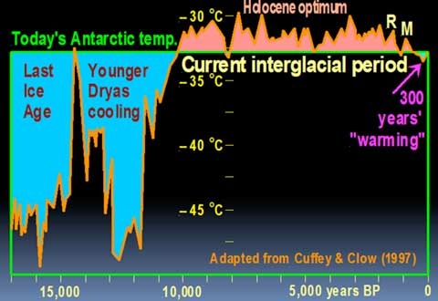
Contrast this with the content of his latest offering at SPPI — Global Warming is not happening, published on February 27. It appears that someone has drawn his attention to the work of his wrinkled retainer, because on page 10 we encounter a new version of his infamous Curry & Clow graph, this time attributed to Cuffey & Clow (1997), confirming Old Scrotum’s detective work. However, unbeknownst to those esteemed researchers, their work in Greenland has magically moved to Antarctica. The temperature reference is now to “today’s Antarctic temp”. Here’s the new graph:
Here’s the previous version:
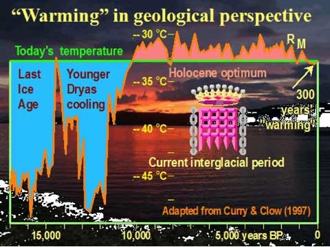
And here’s the original:

Monckton continues to play fast and loose with the facts. He is deliberately bending, falsifying and fabricating scientific data in order to support his contention that:
There is no climate crisis. The correct policy for dealing with it is to have the courage to do nothing.
This is the work of a second-rate propagandist.
Monckton, you are a hypocrite, and those who promote your “work” should share your shame. But I won’t hold my breath waiting for a public correction.
[PS: It would be interesting to know if a version of this graph appears during his talk at the Heartland gabfest…]
[PPS: Click on the very excellent image of Monckton to read Monbiot’s top ten deniers list in today’s Guardian.]
Well, he does say “adapted from Curry and Chow”
Obviously he has applied a hemispherical correction factor!
“Even with different models and different assumptions, it appears that geological constraints pose an important limit on CO2 emissions. All the studies discussed here arrive at the conclusion that, even without policy interventions, the CO2 concentration in the atmosphere will stabilize in a range that goes, approximately, from 450 to 600 ppm. These values are far below those of the “business as usual” (bau) scenario of the IPCC that predicts a CO2 concentration of about 1000 ppm by the end of the century.”
http://europe.theoildrum.com/node/5084#more
Steve.
It would be nice if that were true but that article looks very much like a ‘once over lightly’ analysis. Ignoring, as it does, little things like coal (peaking 100’s of years out) and non-conventional oil sources (tar sands etc).
It also downplays earlier consideration of this…I think the subject even gets addressed by Gareth in “Hot-Topic” (the book) which is now a couple of years old.
When talking about geological limitations it would also seem appropriate to look at the geological record for how high CO2 concentrations have gone in the deep past……way above 1000ppm is the answer.
So, I don’t think the crisis is cancelled just yet.
Andrew
PS. One interesting and positive aspect of your comment is the implicit acceptance that CO2 is a potential problem. Something I don’t think we have seen from you before, Steve.
So, Steve, not rushing in to defend the potty peer? Just trying to distract attention?
Andrew H,
I wouldn’t dismiss all of the conclusions of the people at The Oil Drum. That post is ‘evidence light’, but many are not and are grounded and well considered.
From my reading we very likely peaked in 2005 for oil. Gas is near (2020) and coal not more than a few decades away (2025 best case – EnergyWatch Group). Energy supply changes due to peak oil will bring forward the timing of peak gas/coal. I’m now persuaded that the current recession/depression was sparked by peak oil driven price impacts. This may be the first economic shock of the post peak era.
e.g. From Deffeyes Blog at Princeton Univ:
http://www.princeton.edu/hubbert/current-events-08-05.html
Check out the graph – see what happens to the Price-Supply relationship at $40 per barrel (2005). The price has now gone down due to demand drops from the recession/depression, watch what happens as economic activity picks up.
Despite the implicit limitation on emissions below IPCC levels (based on IEA data), I still think that to claim that peaking of fossil fuels means we don’t have to worry about climate change is not evidentially supported. As we are forced onto lower grade fuels (particularly coal) emissions per joule will escalate. And in the post peak era we will have to adapt against a background of economic contraction/stagnation. The science seems quite clear to me that the risk of secondary amplifying feedbacks has been underestimated (e.g. ocean uptake of CO2 and as Gareth has reported; methane). Peak means about halfway through – which means we can still emit as much as we’ve emitted so far.
Monckton’s a joke.
I think this is sufficiently related to your post Gareth for it to be recorded here. Richard Lindzen is at the Heartland conference with Monckton. In a post on Climate Progress Joseph Romm has just reported that Lindzen went from denial to defamation as he smeared the reputation of one of the greatest living climate scientists, Wallace Broecker, the author of Fixing Climate (referred to in the post More Than Dreaming which follows this one).
“Lindzen called out colleagues such as Wallace Broecker, a geochemist at Columbia University’s Lamont-Doherty Earth Observatory, whose work, Lindzen said, ‘clearly shows that sudden climate change occurs without anthropogenic influence, and is a property of cold rather than warm climates. However, he staunchly beats the drums for alarm and is richly rewarded for doing so.’
“And so Richard Lindzen — a man who would be unknown to the public, with no ‘acclaim’ whatsoever, if not for his denial of our basic understanding of climate science — accuses one of the nation’s preeminent climate scientists of lying to the public for fame and money. I’d also note that back in 1995, journalist Ross Gelbspan explained in Harpers that it is Lindzen who is far more richly rewarded for spreading anti-science than Broecker ever has been before explaining science: ‘Lindzen, for his part, charges oil and coal interests $2,500 a day for his consulting services.’
“Shame on you, Richard Lindzen.”
If we’re talking money, let’s take a closer look at that Heartland conference…
Kevin at desmogblog has done a bit of research on just who is funding it.
Not forgetting that Heartland paid for our Bryan Leyland and others from Aust/NZ to go last year…
I’m amazed that John Key isn’t there – after all, he and Klaus have something in common – the only two world leaders who have expressed scepticism about the science. Luckily for the Czechs (and the EU), Klaus’s Presidency doesn’t include running the day to day business of Govt. Unluckily for New Zealand, Key is.
See also this article at PR Watch about Heartland funding.
Hello Cobbly(worlds?)
I certainly didn’t intend a wholesale dismissal of the Oildrum…just the notion that peak oil would save us from AGW.
Which as Gareth points out is Steve’s attempt to distract as from peak crankdom, so I’ll say no more.
Andrew
Don’t worry too much, Andrew. I’ll also note that the numbers for “peak carbon” quoted — from 450ppm to 600ppm — ignore any contribution from carbon cycle feedbacks, and are quite sufficient to cause us major problems.
250 year triangular filter. Hmm.
“For if one considers the entire Holocene period since the end of the last Ice Age 11,400 years ago, temperatures have been warmer than the present almost throughout (e.g. Curry & Clow, 1997: figure 11):”
I haven’t read the original study, I wonder where the authors would peg the current temperature level at…
Actually, with slight corrections (“today’s temperatures” level) and additions (historical temp data to the end and after that IPCC scenarios) the graph would be a powerful indicator FOR worrying – add the “civilization developed” tag to the last 6000 years….
If you’d like to have a go at Photoshopping Monckton’s graph, I’ll be happy to publish it!
There’s the issue that this is a curve from one point, and it is in the arctic that might vary a lot more – hence you can’t really use global temperature prognoses to combine with this curve. :/ As everybody knows, the arctic has already warmed more than the global average and this is assumed to continue.
(Anybody read it, how did M get his “current” level? Just look from the graph or somehow else?)
Also here the problem is the tyranny of time scales, hence combining is a little hard.
I remember seeing some picture series with always having an inset marker for context and the next pic was then that area zoomed in. Like you start out from millions of years. Don’t remember where it was.
Someone else can properly do it with more accuracy and better software than MSPaint. 🙂
(warning a huge 600 kb picture)
http://i43.tinypic.com/2wlsig1.png
Did my previous comment vanish?
Trying for the third time (if duplicates result the admin can remove):
My sketch is at i43.tinypic.com/2wlsig1.png But it’s not very good, done with MSPaint.
Also, this is the arctic and one place, which means polar amplification and increased variance and other things and isn’t that directly comparable to global averages.
Sorry gravity, you hit the spam filter for some reason. Given that Monckton felt free to adjust the data to suit his message, I think you should feel free to do the same!
Well, perhaps he does, but how does this graph support that conclusion?
Oh, do keep up Richard. This is my second post on the subject. Monckton takes a graph from a 1997 paper, modifies and distorts it, adds stuff, and then pretends that it says something the original paper never claims. If that’s not “shameful tampering with the evidence” (from his Heartland keynote address) then I don’t know what is.
f
[Treadgold edited this to remove his original comment: I’ve put his original words back, so that my following comment makes sense. GR]
So the graph you announce as “the original”, the monochrome one with no attribution, is from the 1997 paper? Presumably it’s uncontested. If so, then the graph from Monckton is the same one; it’s abridged to just 17,000 years out of 50,000, the x-axis is reversed and some labels are altered, but what data were changed?
I’m not defending anyone here, just asking. I’m unfamiliar with this squabble, but the crime of which you convict Monckton is unsubstantiated by what I see so far.
Richard, look again. Monckton takes a graph from a 1997 paper and manipulates it without using the original data (because the underlying data is not provided in the paper). Stretching the timescale gives the “new” graph unwarranted precision, as does failing to note the use of a 250 year filter. The resulting curve is similar but not the same: look at where he draws the “today’s temperature” line (itself an entirely arbitrary choice). It goes through the first post-ice age peak (pre Younger Dryas), and through a dip in the early Holocene about 8,000BP. The original graph doesn’t do that. Then look at the shape of the curve up to present. Monckton has clearly exaggerated and altered the line. He has also added an upwards tick at the end which is not in the original. Apart from all that, he uses the manipulated data to make claims not in the original paper, and makes it appear that Cuffey & Clow support his claims.
This isn’t “adapted from”, this is manipulation and misrepresentation at its worst — made all the more piquant by Monckton’s insistent harping on about fraud by real climate scientists.
From his Heartland keynote:
Unless of course it’s Monckton doing the altering.
Those words were accompanied by the “new” graph. Monckton showed it knowing (because he must have been made aware of his misattribution to correct it) that his manipulation had been noticed. None — none — of the people in attendance called him on it. He got a standing ovation, in fact.
Monckton is established by his own words and actions as a hypocrite and charlatan. He has no vestige of credibility in climate matters. All of those “elite scientists” (Heartland’s phrase, not mine) who stood and applauded him at the conference share his shame. As will you if you defend him further.
Now I wonder what you think I said, Gareth. I’m quoted as saying “f” (a random keyboard strike).
You are wrong to say I have defended Monckton. I may yet, but I have not yet so you may not say so yet.
You speak of shared shame among the sceptics; it would be the same, then, among those warmists who continue to idolise Man and his mann-made temperature graphs?
When I said, in panic, since the time for editing had but eight seconds to run, “f”, I was in the midst of reading your over-blown but occasionally humorous parody of Monckton’s perfidy. I had realised there were facts involved not clear from the posting I was asking about and wanted time to reconsider.
But, again, what do you think I said?
Gareth, you have gone too far and shown you are not to be trusted. I explain that I wanted time to reconsider my comments, having started reading your first post on this graph. But I see now that you have suddenly reinstated them! You cretin! You insubstantial worm!
You say: “so that my following comment makes sense.” Be man enough to delete your beautiful prose! Don’t misrepresent what I’ve said, you snivelling coward!
You provide an Edit function, to change one’s comments after submitting them. What right do you have to change my changed mind again?
My comments above stand for themselves, but you, sir, are a hypocrite. Honour your guests’ editing decisions or remove the editing function.
Baa, humbug!
I simply reposted the words you edited out, so that my comment made sense. The edit function is provided so that people can correct errors or rephrase their comments. On blogs with no edit function, your original words would have stood.
If you want to defend Monckton, go right ahead. I could do with a laugh…
Your snide comments on Mann cut no ice here. If you want to be rude about respected climate scientists, go and do it on your own blog. I won’t tolerate it here.
As for my being a hypocrite: you can think what you like. I stand by what I write.
Richard: your words say more about you than I ever could (or would want to). 😉
😀
Richard, if you want to stop stepping on rakes, perhaps stop stomping around. (Paraphrasing Eli from memory.)
250 year triangular filter. “Present temperatures.”
The graph’s main purpose is to insinuate that even a significant temperature rise leads to a level that is less than some other times in the past during the holocene.
But those are never presented in the context.
And anyway, it’s one measurement spot, with one method.
AFAIK, there are lots of world temperature reconstructions of the holocene (the whole birth of human civilization has happened in the holocene, the period that we are now living).
Glue some global warming projections at the end, and it looks scary. Very scary.