So far, I have posted on the comprehensiveness of the NZ ETS vs the Australian Clean Energy Future ETS, the Kyoto chart junk in the Report on the New Zealand Emissions Trading Scheme, and the over-supply of the New Zealand Units in 2010.
This post mixes two of these ideas; searching out bad charts and looking again at the supply side of the NZ ETS market, how many New Zealand Units were allocated for free to emitters and businesses.
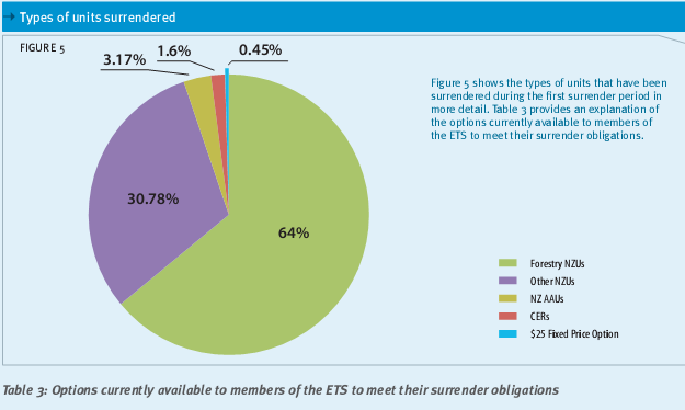
The Report on the New Zealand Emissions Trading Scheme provides in Figure 5 a pie chart of the number of New Zealand Units (NZUs) surrendered by emitters.

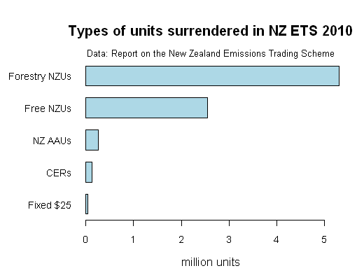
Although the pie chart is Kaiser Fung’s least favourite type of chart, this pie chart isn’t too bad. There are a manageable number of categories; only five; and no 3-D effects. The key point is clear from the pie chart, that about two-thirds of NZUs surrendered were purchased from foresters. Also the chart follows the Ministry for the Environment usual practice of providing the original data underneath so you can do you own chart. I did a bar chart of the data, re-labelling the “Other” NZUs as “Free NZUs”.

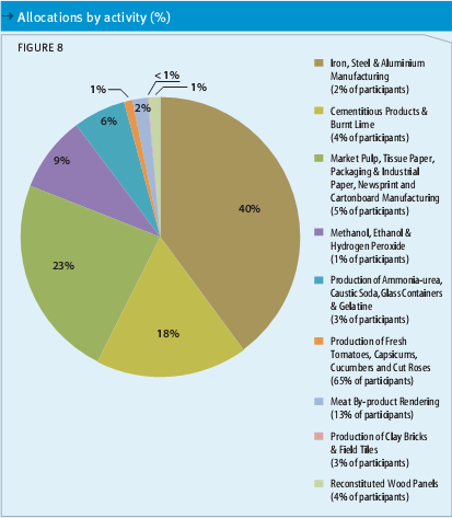
The free allocations of NZUs are shown in another pie chart, Figure 8.

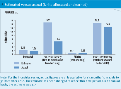
The allocations to industry activities (the pie slices) are charted not as as numbers of NZUs as in Figure 5, but as proportions. The proportions are noted as percentages on each pie slice. There is no table of data accompanying the chart. This is clearly inconsistent with Figure 5. Why doesn’t the pie chart show either the actual total number of NZUs allocated, or the number allocated by activity? The total number of NZUs allocated for free in 2010 is not disclosed anywhere else in the Report on the New Zealand Emissions Trading Scheme. There is another chart, Figure 11, that appears to show free NZU allocations to each industry sector.

Maybe these add up to the total “pie” in Figure 8. I added them up; 1.76 million NZUs given to industry, plus 6.9 million NZUs given to pre-1990 forest owners plus 0.69 million NZUs given to fishing quota holders: equals a total of 9.35 million NZUs.
However, the total number of NZUs allocated by free gifting between 1 July 2010 to 31 December 2011 is 12,776,026, according to the Ministry of Economic Development Chief Executives report. So there appears to be a gap of 3.4 million gifted NZUs, not disclosed in The Report on the NZ ETS.
Is this a big deal? I think it is. Dr Jan Wright, the Parliamentary Commissioner for the Environment, describes free allocation for what it is; a subsidy to industry
In her submission on the 2009 amendments to the NZ ETS, Jan Wright said
Allocation is costly. Each credit that is given away rather than kept or sold is a real dollar loss to the taxpayer. And there is another cost: it lessens the incentive to invest in low-carbon technology and emissions reductions. Generous and unlimited allocation that is promised to last a long time –whether or not it actually does – removes the push to transform to a low carbon-intensive economy.
To me this is an unsatisfactory level of disclosure of information. I am struggling to find an explanation for this other than to obscure the amount of subsidies funded via NZUs to emitters such as Comalco. I leave the last word to Jan Wright.
The principle of Parliamentary scrutiny in the Public Finance Act should also apply to allocation. Given the large taxpayer expense, the reason for allocating to a particular sector should be transparent.
The NZ ETS Report disclosure does not meet this standard of transparency.

You’ve mixed up your time periods, again.
The MED CE report is for 18 months. The ETS report is for 12 months. And the industrial data in figure 11 is for 6 months, as it clearly says. Maybe that’s the source of your missing data.
No conspiracy.
The time periods don’t matter and don’t provide an explanation for the difference. The key period for a 2010 ‘participant’ in the NZ ETS with the obligation to report emissions and surrender matching NZUs is from 1 January 2011 to 31 May 2011. As 31 May is the deadline for both reporting emissions and surrendering NZUs. In that five month window, the liable participants must buy enough units from the market to match their 2010 emissions – which they should by then know with reasonable certainty.So that is the demand side of the market. The supply side of the market will be all NZUs (and international Kyoto units) owned by other people and available for sale at that time. The date these units originated is irrelevant to the fact that they are held by sellers at the time when buyers will have to buy them.
Companies will buy units for more than the next year. And foresters will not be forced to sell this year if they believe prices will be better in the future.
Note foresters entered in 2008. Prices were not zero until July 2010.
The demand side is all future obligations for eternity, cognisant of the cost of abatement. Supply is the marginal cost of generating units. You don’t understand economics. If you look at a simple supply demand graph you will not see two dots representing current market conditions, but two lines: supply representing the marginal cost of supply, and demand representing the marginal utility of consumers.
The cheaper the cost of supply, the more ‘quantity demanded’ will eventuate. The higher the utility from consumption, the more ‘quantity supplied’ will eventuate.
Maybe go read a first year microeconomics text book.
_R2D2,
If I didn’t know you better I would probably be thinking you are just showing off your possession of a first-year micro-economics text book. I agree with your first two points. However, nothing you have said is any help in finding the missing 3.4 million emission units allocated to industry.
I’ve already suggested an answer (your source data on allocations relate to different time periods – and you make an assumption that all allocation is to industry). Your reply about supply and demand missed the point.
password1,
On reflection, yes you are right. My response to your suggested answer was really a response to a different question. Sorry about that. Yes I did make an assumption. But I didn’t have much choice given the level of information given in The Report on the New Zealand Emissions Trading Scheme. I don’t think it is too much to ask that a report on a complex subject like the NZ ETS should clearly present data in a consistent way. How hard would it have been to have included the actual numbers of units by activity in Figure 8, the pie chart of units allocated? They did that for Figure 5, the pie chart of units surrendered. How hard would it have been to present both six month and twelve month data?
BTW I sent an email to Dr Smith’s office asking for the data for the actual data for Figure 8. I will post again when I get it. I will ask about the the 12.77 million units allocated soon.