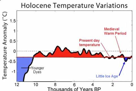
Don Easterbrook seems to have decided that when under pressure, attack is the best form of defence. He’s replied to my original post and Tim Lambert’s added exposure of his statistical sleight of hand in this document (pdf) — apparently composed as a reply to a query from Andy Revkin of the New York Times‘ Dot Earth blog. Here’s how he ends his piece (it’s all in caps because that’s the way it is in his document, and I wouldn’t want to alter the data…):
CONCLUSION — THE ‘FAKE DATA’ CHARGE BY THE ‘TRUFFLE GROWER’ IS A COMPLETE LIE–THE DATA COMES FROM THE WORLD STANDARD OXYGEN ISOTOPE RECORD FROM THE GREENLAND ICE CORES, AND THE RECENT TEMPERATURE DATA IS FROM SATELLITES. ALL OF THIS DATA IS EASILY AVAILABLE FOR ANYONE WHO WANTS TO PLOT THEIR OWN GRAPHS. THE CHARGE THAT THIS DATA HAS BEEN ALTERED IS A DISPICABLE LIE.
Unfortunately for Easterbrook’s credibility, all he’s done is confirm his own mistakes. He not only attempts to defend the wrong graph, but confuses me with Tim Lambert and underlines the considerable statistical naivety in his analysis of recent global temperatures. To make matters worse, a pixel-by-pixel comparison of Easterbrook’s slide nine and the Global Warming Art equivalent shows that they are a perfect match — confirming my original charge: that Easterbrook had crudely altered the GWA original to better suit his storyline.
Continue reading “Cooling-gate: Easterbrook defends the indefensible”

