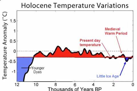
Don Easterbrook, the retired geology professor who predicted that the world was headed for decades of global cooling at the recent Heartland climate sceptic conference, appears to have crudely faked one of the key graphs in his presentation in order to reduce modern temperatures and make historical climate look warmer than justified. Looking through Easterbrook’s slides, it seems he has taken a graph of Holocene temperature variations prepared by Global Warming Art (used at Wikipedia), and altered it to fraudulently bolster his case.
Here’s Easterbrook’s graph (slide 9, ppt file available here):

When I saw that graphic, it struck me as strangely familiar. The typefaces and presentation are reminiscent of graphs prepared by Robert A Rohde for Global Warming Art. So I checked, and this is what I found:
Continue reading “Cooling-gate! Easterbrook fakes his figures, hides the incline”

 Bob Carter’s writing style (logorrhea, leavened with pomposity) is on display once more at Quadrant Online, and this week’s missive from planet Bob – headlined