
 Eli Rabett, that ever-curious but lovable lagomorph, has noticed the appearance of an apparent annual cycle in the Arctic sea ice area anomaly chart at the excellent Cryosphere Today. I mentioned the same thing in a post on Arctic sea ice back in April, and hinted that I might look at it “another day”. Well, that day has come, not least because the ice “experts” at µWatts have been suggesting it might be a satellite problem (it isn’t).
Here’s the relevant chart from Cryosphere Today. I downloaded it last night, and added the crude red circle round the interesting bit (click the image to see the current version of CT’s graph — it updates daily).

It covers the entire satellite record, and shows the anomaly — that is, the difference between the actual ice area for a given day and the average ice area for that day over the entire period. Looking at the anomaly should remove the annual cycle, because that’s accounted for in the average that forms the baseline. Nevertheless, from 2007 onwards it looks very much like the anomaly is itself showing an annual cycle.

Here’s a close up. The first big drop occurs in 2007, the year of the record summer minimum area, but it’s there again in 2008 and 2009 — and shows every sign of happening again this year. If you look closely, you’ll see something just as interesting as the cycle itself. The maximum anomaly occurs after the summer sea ice minimum. This is obvious on CT’s graph of area over last two years. The red line at the bottom is the anomaly, and you can see that the maximum anomaly occurs after the ice area has started to regrow — which means that the freeze-up has begun later than the 30-year average. However, once the ice starts refreezing, the anomaly decreases rapidly and gets up towards the zero line over winter. So what’s going on? Why is the late summer anomaly so much greater than the winter anomaly, and why have we only started seeing the cycle in the last few years? Here’s my stab at an explanation…
Consider the geography of the Arctic sea ice. You can divide it very roughly into two regions — the ice in the Arctic basin, that is the ocean around the pole, north of Canada, Alaska, Siberia, Svalbard and Greenland, and the sea ice that forms outside the Arctic basin (Barents Sea, Bering Strait, Kamchatka, etc). Every winter the Arctic basin freezes up. That happens every year without fail (so far). The winter anomaly therefore depends on the amount of sea ice that grows outside the central Arctic. But all that ice melts long before we get anywhere near the late-summer ice minimum — in other words, it’s irrelevant to prospects for the summer.
Summer anomalies are determined by the ice melt in the central Arctic. Up to 2007, the summer melt mainly took place around the Canadian and Siberian shores, and in the Barents Sea. That’s why the Northwest and Northeast Passages were/are a tricky proposition — they depend on the fringes of the polar sea ice cap melting. In 2007, however, ice over a large chunk of the central Arctic basin melted away, setting a new record minimum by a 25% margin. That delayed the start of the freeze-up significantly, and so the anomaly increased to more than 2.5m km2 below average. But this is the central Arctic we’re talking about, and still a very chilly place, so even though the freeze-up was delayed, the sea ice regrew as autumn turned into winter and covered the entire basin.
The emergence of an annual cycle in the anomaly therefore occurs because there’s now more variability in summer area/extent than there is winter area/extent, and because there is, in absolute terms, more central Arctic ice to lose. 2007’s record melt triggered the appearance of the cycle. And as and when we hit new record minima, we’re likely to see even bigger swings in the cycle as long as the entire central Arctic freezes up every winter.
[This is not news to real ice scientists, by the way, because model runs show similar sea ice behaviour as the ice declines — though it’s being seen rather sooner than modelling suggested. This post at Primaklima at Scienceblogs.de shows some examples. H/t to Georg himself in comments at µWatts]
There is another tantalising hint to be discerned in the new cycle. In each of the last three winters, the anomaly has approached zero — and sceptics have been keen to trumpet the ice as being back to normal. As we’ve seen, this is because of the growth of sea ice outside the Arctic basin, and so it is irrelevant to the state of the ice that will melt the following summer. The slightly reduced winter anomalies (compared to the four or five years prior to 2007, though not earlier) might be related to changes in weather patterns outside the central Arctic (which has been warmer than average throughout recent winters, while parts of Siberia have been colder), or perhaps to reductions in salinity caused by greater run-off of fresh water (making it easier to freeze) — but that’s highly speculative.

It’s interesting to note that the annual area anomaly cycle is to a certain extent mirrored in the PIOMAS ice volume data. Here’s the last few years snipped from their latest chart. There was a record volume anomaly in summer 2007, as you might expect, followed by a recovery over winter as the ice cover regrew. Another minimum occurred in summer 2008, followed by a smaller regrowth, and then another drop to a record minimum in summer 2009. Not much new ice since, though, and in the last couple of months the volume anomaly has plummeted. They’ve had to add another section to the bottom of the chart since I last posted it here…
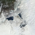
Talk of betting on the summer minimum is underway at the mustelid’s place, and I am on record there as suggesting that this summer will see a greater melt than the last couple of years. A new record? Perhaps, but I’m not betting on it. Meanwhile, the SEARCH forecasting exercise has posted its first “pre-release” ice forecast: Adrienne Tivy, a post-doctoral fellow at the International Arctic Research Center (IARC) has developed a statistical model that projects a 4.539m km2 Sept average, “below normal” but way above the last three years. Still, when you look down on the top of the world (or bottom, from my perspective) from the vantage of NASA’s Terra and Aqua satellites, the eyeballs in the sky (there is life beyond the pooliverse!) make the sea ice look very broken up and mobile. Click on the little image at the top of the post (which shows open water at the western entrances to the NW Passage yesterday) to see the latest Arctic mosaic, and make up your own mind…
[Tomorrow — another dreadful pun, sorry. 😉 ]
cool face in the ice snapshot at the top of the post 🙂 However the face has already gone from the live image..
Hit the "previous" button on the mosaic page, and it will take you back a day — and to the face (which I didn't notice until you pointed it out…).
Nice work this brings us back to the issue of a paper I reviewed and was published a year ago on the The emergence of surface-based Arctic amplification (Sereeze and others, 2009) This is largely a fall function and reinforces temperature induced sea ice loss. They explain your idea of the fall maximum anomaly well.
Thanks Mauri, I had that paper in mind (and the WWF Arctic report which gives a layman-friendly explanation) as I was writing.
"Cripes! It's all over now." said Boot.
My maternal grandparents read the Daily Mirror, and when we went to see them during the summer holidays (this would be the 1960s), The Perishers was always my favourite bit of the paper. Not much about them on the web, but this page is a nice overview.
The Perishers were born in the same year as me (IIRC). Grateful as I am, we didn't shuffle off in the same year!
Strangely (perhaps), it was my paternal grandparents who read the Daily Mirror, and I was a frequent visitor to them throughout the 60s and early 70s. The "Eyeballs in the Sky" were my favourite bits without a doubt, and I looked forward to them arriving each year.
Thanks for the perishing link.
I disagree! (It doesn't matter because I'm a know not.)
You say: "reductions in salinity caused by greater run-off of fresh water (making it easier to freeze)" is highly speculative. It's not speculative in the least! (Right?) Your sea ice volume figure from PIOMAS shows that there is a lot of freshening going on as the ice melts. And although I'll defer to you (and to Mauri) that the delayed freezing is important, I thought you might focus on the fact that the winter maximum area has been as high 2004 in each of the last three years.
Oh, now I've started to look in more detail. Maybe you don't like the 'fresh' idea because you've got to explain how that fresh water from melting/thinning multi-year ice in the Arctic Basin gets to the other seas. And I just searched around on the CT site and found that, for 2009 at least, it looks like a greater than usual area froze in the Bering Sea. Everywhere else seemed to be pretty normal (or below normal) in ice area this last winter. I wonder where the anomalies were in the previous winters.
There is certainly a noticeable reduction in salinity occurring in the Arctic Ocean, and it may be at least a factor in the rapid re-freeze we see each autumn/fall. But as the winter maxima occur outside the Arctic (except for the Barents Sea), and I'm not aware of changes there, it'll have to remain speculation…
>"has posted its first “pre-release” ice forecast: Adrienne Tivy, a post-doctoral fellow at the International Arctic Research Center (IARC) has developed a statistical model that projects a 4.539m km2 Sept average, “below normal” but way above the last three years."
Quote: "While the model over-estimated ice area for the three independent forecast years (2007–2009), the categorical forecasts of below normal ice area were correct for each year."
Would I be being unduely harsh in paraphrasing this as:
The model was miles out in the three independent forecast years but never mind we will ignore this and carry on regardless throwing in some bluster about the categorical forecasts being correct in the hope this diverts attention from how far out the model was.
My interpretation of this is that for those three independent forecast years the model predicted way above what happened and the best you can do with that is say that an adjusted version of this model now says we should expect something like what the last three years have done. Even that attempted 'adjusted to be more useful model' does not appear to be saying very much.
Harsh. But fair. That was pretty much my reaction when I looked at her forecasts.
I still don't like the look of what I'm seeing on the MODIS images, but that's unquantified and unquantifiable…
Good article. You need to mention that what started in 2007 is the annual summer melting of the Leptev, Kara, East Siberian, Chuchki, and Beaufort Seas. These seas normally stayed mostly frozen, now the mostly melt. The importance is that these seas are now absorbing sunlight during much of the summer and warming the Arctic Ocean.
The deniers like to point out that the melting Arctic ice does not matter since it does not raise the ocean level. They miss the point. The impact is the loss of albedo. The more summer ice gone means the more solar heat absorbed. Thus the Arctic warms even faster.