Still warmin’ after all these years (Prat watch #5.6)

1967withlines

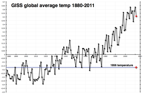
Courtesy of Texas state climatologist John Nielsen-Gammon, a very nice graphical demonstration of why “warming” hasn’t stopped in the last decade (or two). Nielsen-Gammon took the GISS global temperature series, classified years as El Niño dominated, neutral, or La Niña, excluded the influence of the Pinatubo-cooled years in the early 90s, and then calculated the trends for each set. The graph really says it all, but his blog post provides all the analysis. The next El Niño looks as though it’s going to be interesting

[The author, composing.]

Cuckoo cocoon (Prat Watch #5.5)

Something stirred inside the carefully cultivated cocoon of ignorance at Richard Treadgold’s Climate “Conversation” blog, but I don’t think it was the butterfly of understanding preparing to inflate its wings. Something much more subterranean, I suspect. Needled by my post about said cocoon (namely, Treadgold’s insistence that “global warming has not happened for about 15 years, unless you take a micrometer to the thermometer“), RT issues a bold challenge: Well, where’s your evidence, Renowden?
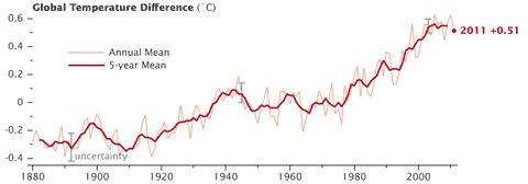
He heads his post with a graph lifted from JunkScience (that well known purveyor of same), showing the HadCRUT3 monthly temperature series from 1978 to date. Amusingly, Treadgold makes an error before he even begins the meat of his diatribe. The caption he provides to the graph includes this:

The graph that proves no significant warming for about 15 years – since about 1996. Measured by satellite, not the unreliable hand of man.

The HadCRUT3 global series is most assuredly not a satellite generated temperature record. But we’ll let that pass, shall we, and take a quick canter through an answer to his challenge. I shall ignore Mark Twain’s advice just this once, in the hope that some light may shine in to the dark corners of his misunderstanding.

Continue reading “Cuckoo cocoon (Prat Watch #5.5)”

2011: a hot cold year

2011GISSgraph480

The NASA numbers are in, and 2011 was the ninth warmest year since 1880 — 0.51ºC above the 1951-80 global mean. Nine of the ten warmest years in the long term record have occurred in this century. According to the analysis released by James Hansen and his team at GISS, a combination of low solar activity and the continuing cool phase (La Niña) of the El Niño Southern Oscillation kept global temperatures down — but as this map from the Earth Observatory shows, many parts of the world still managed to experience a very warm year, especially over the Arctic and Russia:

2011GISSglobe480

NOAA’s overview of last year puts 2011 in eleventh place in their long term series, and confirms that the USA experienced a record 14 extreme weather events that caused more than $1 billion in damage — up two from their previous estimate.

Continue reading “2011: a hot cold year”

McLean’s folly 2: the reckoning

Ten months ago, Aussie “sceptic” John McLean predicted that 2011 would be “the coolest year since 1956”. I pointed out at the time that this was nonsense, and so it has proven to be. I’ve taken the GISS global temperature figure for Jan – Nov 2011 (+0.51ºC compared to the 1951-80 average) and added it to the graph I created to illustrate the full extent of McLean’s folly:

Maclean1956outcome

Last year was warmer than 1956 by a whopping 0.68ºC — about three standard deviations, in statistical terms — making McLean’s forecast an abysmal failure. Yes, 2011 was cooler than 2010 or 2009, but still one of the top ten warm years.

Continue reading “McLean’s folly 2: the reckoning”

You’re (not) the BEST thing

Set aside for one moment the fact that New Zealand has just (in every sense of that word) won the Rugby World Cup for the first time in a quarter of a century, and consider instead events in the world of temperature records. (Don’t worry, it won’t take long). A team led by Berkeley physicist Richard Muller — the Berkeley Earth Surface Temperature project (BEST) — has successfully reinvented the wheel, by demonstrating (once again) that the planet has been warming over the last 150 years. Tim Lambert at Deltoid explains the algorithm Muller employed:

  1. State that “reported global warming may be biased by poor station quality“.
  2. Collect funding from Charles G. Koch Charitable Foundation.
  3. Make the utterly predictable finding that warming is not a product of poor measurement.
  4. Brief reporters.

Michael Tobis at Planet 3.0 puts the affair in its proper context:

The science has not changed a whit – no serious scientist cares very much that the record has been confirmed yet again. Under ordinary circumstances this paper would have trouble getting published. This is not a red-letter day in scientific history. No new information is on the table. It’s posturing.

As for posturing, Brian Angliss at Scholars & Rogues points out that a certain US weather station quality control effort is under a little stress. One wonders if this might not spread to those who would wish to cast doubt on the NZ record?

[The Style Council]