Thin ice #2

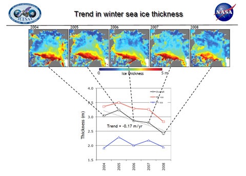
New analysis of Icesat data by a NASA team headed by Ron Kwok shows that from 2004 to 2008 Arctic winter sea ice “thinned dramatically”. Icesat measures the “freeboard” of the sea ice, the amount above water level. The graph below shows the extent of the decline, which is most marked in multi-year ice (ice that survives more than one summer).

Icethickness09.jpg

[Click image for bigger version]

In 2003, 62 percent of the Arctic’s total ice volume was stored in multi-year ice, with 38 percent stored in first-year seasonal ice. By 2008, 68 percent of the total ice volume was first-year ice, with 32 percent multi-year.

The information on ice thickness is critical to understanding what’s going on in the Arctic, as Kwok notes:

“Ice volume allows us to calculate annual ice production and gives us an inventory of the freshwater and total ice mass stored in Arctic sea ice,” said Kwok. “Even in years when the overall extent of sea ice remains stable or grows slightly, the thickness and volume of the ice cover is continuing to decline, making the ice more vulnerable to continued shrinkage. Our data will help scientists better understand how fast the volume of Arctic ice is decreasing and how soon we might see a nearly ice-free Arctic in the summer.”

NASA also provide some very nice visualisations of the data: animations of the changes in autumn and winter ice thickness as well as still images. Well worth a look. For more about NASA’s work on thickness, check this earlier post.

Also well worth checking out: The Standard posts a report a lecture about Andrill and the West Antarctic ice sheet by Prof Tim Naish. Earlier in the week, the Herald also reported on a lecture by Prof Peter Barrett that covered similar ground. I’m hoping to persuade the good professors to provide more detail here sometime soon…

This year’s model

[youtube]5tRiZG-yR24[/youtube]

Take MIT’s global ocean model, assimilate data from NASA’s fleet of satellites, and run the whole thing through two of the world’s most powerful supercomputers on a much more detailed grid than used before, and you get this stunning animation of ocean currents from 1994 to 2002. It makes fascinating viewing: look for the complex whorls of currents to the southwest of NZ, or the loops of the Gulf Stream (red/white is fastest moving water).

This sort of detailed ocean modelling is important for capturing the interactions between atmosphere and ocean: useful for improving weather forecasting on short and medium term timescales, as well as improving climate projections on regional scales. NASA JPL press release here.

Cracking up

Wilkins2009422.gif

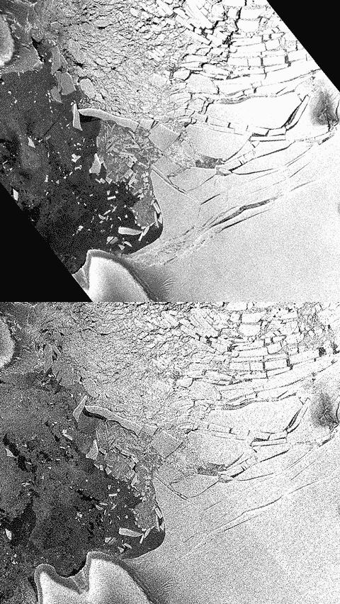
With the “pin” to Charcot Island gone, big cracks that first formed in 2008 are are opening up in the Wilkins ice shelf, and a new break up is taking place close to Latady Island. The animation above uses ESA “webcam from space” images captured on April 18 and 21 (the latter has black corners). Latady Island is bottom left. Judging by the scale on the NASA image below, the big crack above bottom right has opened up by a couple of kilometres, and the whole assemblage of chunks of shelf are moving northwards. It’ll be interesting to see if new cracks form deeper into the shelf (bottom right) as the new bergs move away. Meanwhile, NASA’s Earth Observatory helpfully provides a new photo-like image of what was the base of the ice bridge, captured by the Terra satellite on April 12:

NASAWIlkins200904.jpg

And while we’re on the subject of ice, the Earth Observatory has just posted an excellent new feature article on sea ice, covering both ends of the planet and illustrated with some spectacular imagery. Well worth a read for anyone wanting an in-depth introduction to the state of play before the Arctic melt season really gets underway.

[Nick Lowe]

Where the streets have no name

JanMayenvortexsmall.jpg

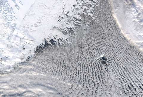
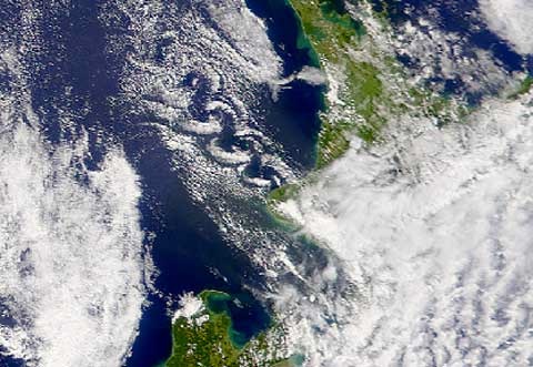
Not much of a climate connection here (though Greenland and sea ice are in the picture), but regular readers will know that I’m fond of looking down on the Earth from space. This image from NASA’s Earth Observatory shows a beautiful von Karman vortex street downwind of Jan Mayen island in the Greenland Sea (600 km N of Iceland, 500 km E of Greenland), surrounded by more conventional cloud streets running south off the sea ice. Click on the image for more detail, and check out the Wikipedia page for an excellent animation showing how the vortices form, and more pictures. We get them too: here’s a NASA satellite image from 2002 of a similar vortex street forming to the west of Mt Taranaki:
Taranakivortex.jpg

Normal climate service will resume shortly…
[Pet Shop Boys]

Smoke on the water

SmokeNZ.jpg

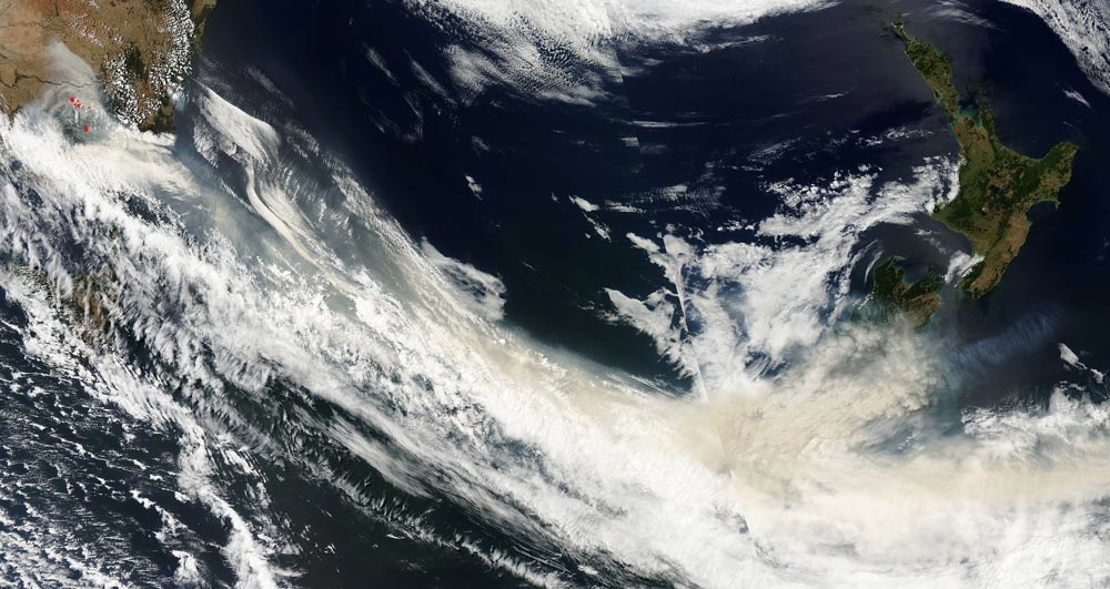
On Monday there was a haze over the Canterbury plains. It looked like someone was burning scrub to the west. Today’s MODIS Image Of The Day shows the source. The image captured on Feb 8th shows that smoke travelled from the Victorian fires (red dots top left — click image to see larger version) across the Tasman and over the South Island. Last weekend was also notably warm on the east coast, as air already warmed by Australia’s heatwave reached NZ and experienced additional heating due to the fohn effect when crossing the Southern Alps. The smoke followed along…

PS: For those not familiar with the local geography, the distance from Melbourne to Christchurch is roughly the same as London to Moscow, or Houston to New York.[Hat tip: MH]

[Deep Purple]