Too hot (and here comes the surge)

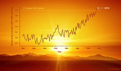
GISS20152015 was the hottest year since records began in all of the major global temperature datasets, and by a huge margin. The world is now more than 1ºC warmer than pre-industrial temperatures — pushed there by rapidly rising levels of greenhouse gases in the atmosphere, and helped a little by the current very strong El Niño. And because El Niño’s major impacts on global temperatures happen as an event declines, we can expect 2016 to be even warmer.

Carbon Brief has an excellent analysis of the new record here. See also NASA and NOAA’s joint announcement, the NASA press release, and Hansen et al’s overview (pdf). Here’s the latter on the outlook for the rest of the decade:

We can also say with confidence, because of Earth’s energy imbalance (energy absorbed from sunlight exceeding heat radiated to space), that the present decade will be warmer than last decade. Already the first half of the present decade is almost 0.1°C warmer than last decade. Strong La Niñas commonly follow strong El Niños, so it is likely that 2017 and perhaps 2018 will be quite cool relative to 2015-2016, but the decade as a whole should be considerably warmer than the prior decade.

Kevin Trenberth provides an interesting overview at The Conversation, detailing some of the weather extremes delivered by the current El Niño, and notes:

What we have seen this past year will likely be routine in about 15 years, although regionally the details will vary considerably. Indeed, we have had a glimpse of the future under global warming.

You wouldn’t want to bet against it continuing… Continue reading “Too hot (and here comes the surge)”

Heat: 2014 breaks global temperature records, 2015 could be hotter

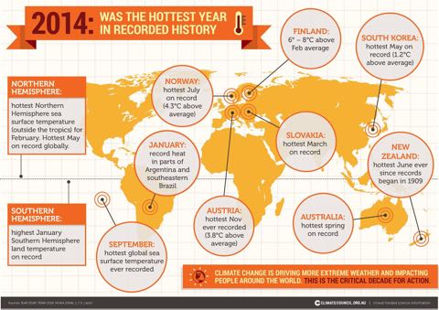
Climatecouncil2014graphic

Last year was the warmest year on record for the planet, analyses by NASA and NOAA show, and it’s possible that 2015 could be warmer still. 2014 was warmer than previous record holders 2005 and 2010, and comfortably ahead of 1998. 13 of the hottest 15 years on record have all occurred since 2000. Remarkably, 2014’s warmth was achieved without much assistance from an El Niño — which boosts global temperatures and is normally a factor in record setting years, as this graphic from Skeptical Science shows:

ENSO Temps static480

For more discussion of ENSO’s impact on temperatures, see Dana Nucitelli’s article at The Guardian, and Jim Hansen et al’s discussion here. Hansen warns that more warming could be on its way:

More warming is expected in coming years and decades as a result of Earth’s large energy imbalance, more energy coming in than going out, and with the help of even a mild El Niño 2015 may be significantly warmer than 2014.

The risk of further rapid rises in global temperatures could also be increased by early signs that the Pacific Decadal Oscillation (PDO) may be shifting to its positive phase, as the Peter Hannam at the SMH pointed out late last year:

“During a positive PDO phase, you’d expect temperatures to keep climbing again as they did in the 1980s and 1990s,” Dr (Shayne) McGregor (of UNSW) said, adding that as PDOs are measured by rolling 11-year averages, it will be a while before any shift becomes clear.

In New Zealand, NIWA reports that the nationwide average temperature for 2014 was 12.8°C, 0.2°C above the 1981–2010 annual average, but that June was tied for warmest in the long term record. The MetService blog provides a good overview of regional weather here.

For further analysis and discussion, there is a lot of good coverage and supporting information available on the web. Here’s my pick of some of the best.

News coverage: New York Times (above the fold on the front page, no less), BBC, Guardian, Stuff (taking the AP coverage). Time makes the obvious point: warming continues unabated, which should give the lie to climate crank nonsense about no recent warming ((…but I won’t be holding my breath…)).

Background analysis: the Climate Council in Australia (who created the graphic at the top of this post), a superb Bloomberg graphic, Climate Nexus, Climate Central (one and two), and for my favourite visual reminder of how warming has progressed, here’s NASA’s animation of global warming from 1880 to 2014:

[Bowie]

This year’s (super) model: visualising atmospheric CO2

Here’s a superb high resolution supercomputer visualisation from NASA’s Goddard Space Flight Center of the flows of CO2 in the atmosphere around the planet. Apart from being beautiful to look at, it shows the major sources of CO2 emissions in the northern hemisphere, and the seasonal change in CO2 levels as the northern hemisphere summer plant growth makes the planet “breathe in”. All the major features of the flow of weather around the planet are shown in great detail. The visualisation was produced by a new very high resolution global climate model called GEOS-5. The NASA press release explains:

…the visualisation is part of a simulation called a “Nature Run.” The Nature Run ingests real data on atmospheric conditions and the emission of greenhouse gases and both natural and man-made particulates. The model is then is left to run on its own and simulate the natural behaviour of the Earth’s atmosphere. This Nature Run simulates May 2005 to June 2007.

It is a very high resolution model:

The resolution of the model is approximately 64 times greater than that of typical global climate models. Most other models used for long-term, high-resolution climate simulations resolve climate variables such as temperatures, pressures, and winds on a horizontal grid consisting of boxes about 50 km wide. The Nature Run resolves these features on a horizontal grid consisting of boxes only 7 km wide.

With high resolution comes the need for a lot of computing power:

The Nature Run simulation was run on the NASA Center for Climate Simulation’s Discover supercomputer cluster at Goddard Space Flight Center. The simulation produced nearly four petabytes (million billion bytes) of data and required 75 days of dedicated computation to complete.

More info — including a closer look at some parts of the globe — here.

[Mr Costello & His Attractions]

PIG and pals pass point of no return – West Antarctic ice melt inevitable

Two new papers published this week suggest that the West Antarctic glaciers draining into the Amundsen Sea — the Pine Island, Thwaites, Haynes, Pope, Smith and Kohler glaciers — are melting rapidly and are now committed to collapse, adding up to 1.2 metres to future sea level rise. In the NASA JPL video above, Eric Rignot, lead author of a paper ((E. Rignot, J. Mouginot, M. Morlighem, H. Seroussi, B. Scheuchl. Widespread, rapid grounding line retreat of Pine Island, Thwaites, Smith and Kohler glaciers, West Antarctica from 1992 to 2011. Geophysical Research Letters, 2014; DOI: 10.1002/2014GL060140)) examining how the glaciers’ “grounding lines” — the point where the bottom of the glacial ice leaves the bedrock and starts to float — have retreated very significantly over the last 20 years explains how they are now melting back unstoppably. Another paper modelling ice loss from the Thwaites glacier ((Ian Joughin, Benjamin E. Smith, Brooke Medley. Marine Ice Sheet Collapse Potentially Underway for the Thwaites Glacier Basin, West Antarctica, Science, DOI: 10.1126/science.1249055.)) finds that it is committed to retreat and collapse via the same mechanism. Lead author Ian Joughin of the University of Washington, told Science magazine:

The next stable state for the West Antarctic Ice Sheet might be no ice sheet at all…

Continue reading “PIG and pals pass point of no return – West Antarctic ice melt inevitable”

Lost in the flood

CantyfloodsNASAEO

This morning’s NASA Earth Observatory image of the day shows the impact of last week’s heavy rain in Christchurch and Banks Peninsula on the sea around. The light blue colours show sediment washed off the land. If you visit the EO page, they provide a helpful reference image: the region snapped from space in late February, when there’s no sign of any sediment at all.

Continue reading “Lost in the flood”