More than a number

[youtube]DLViKhITbrA[/youtube]

If you want to know what’s happening on a stockmarket, the first place to look is at the relevant index — the Footsie (FTSE) for the London Stock Exchange, or the Dow Jones for Wall Street. Those indices aggregate all the price movements over a day into one handy number, to give a quick overview of how the market’s behaving. Now a group of scientists working for the International Geosphere-Biosphere Programme (IGBP) have compiled a Climate Change Index (CCI) to provide the same service for the evidence of climate change. The CCI was launched in Copenhagen yesterday. The video above describes the approach they’ve used, and the “ladder” graphic below shows how the CCI has moved over the last 30 years:

CCI_steps_bigger.jpg

The CCI tracks changes in global temperature, atmospheric CO2, Arctic sea ice, and sea level. An increase in the CCI shows a move away from a stable climate. Over the last 30 years the cumulative shift has been 574 points — in the wrong direction. The IGBP team point out that the CCI responds to global cooling events such as the Pinatubo and El Chichon eruptions, but they are also looking at adding other indicators to the index including land-use, fisheries exploitation, population, fire and extreme events. They are planning to update the index every year, and to backdate it to periods before 1980.

[The Drifters]

Marvellous distempered: the Copenhagen diagnosis

The Copenhagen climate conference (COP15) opens its doors in a little under two weeks. To update participants on the science of climate a new assessment report, The Copenhagen Diagnosis, was released yesterday, and it makes grim reading. Designed to inform “a target readership of policy-makers, stakeholders, the media and the broader public” about the evidence that’s emerged since the 2005 cut-off for the IPCC’s Fourth Report, it is especially strong on the accumulating signs of climate change as it happens.

Evidence of melting of the Greenland and Antarctic ice sheets supports a revision of the expected sea level rise by the end of the century: it “may well exceed” a metre. The rapid sea ice loss in the Arctic in recent years highlights the risks of methane releases from permafrost, but the most direct message is that with global carbon emissions surging up to and beyond the highest of the IPCC’s scenarios, and with pretty strict limits on the amount of carbon we can add to the atmosphere and stay under a 2ºC rise, we need to start cutting emissions soon.

Here’s what the emissions growth looks like:

CopCO2emissions.jpg

And here’s what we need to do to stay under 2ºC:

CopDiagtargets.jpg

It’s a simple enough message. The longer we leave it before starting to cut emissions, the steeper the cuts will need to be. And there’s an obvious corollary: steep cuts will be more expensive. Inaction now means more cost in the future. Where does that leave any government promising to “balance the economy and the environment”?

Below the fold: the full executive summary.

Continue reading “Marvellous distempered: the Copenhagen diagnosis”

A beginner’s guide to the importance of Arctic sea ice

[youtube]_m-M37vc-m0[/youtube]

In this beginner’s guide Tom Wagner, NASA’s cryosphere programme manager, outlines why studying Arctic sea ice is important, illustrating his talk with some great graphics. Meanwhile, the NSIDC has announced the final figures for September’s sea ice minimum:

The average ice extent over the month of September, a reference comparison for climate studies, was 5.36 million square kilometers (2.07 million square miles). This was 1.06 million square kilometers (409,000 square miles) greater than the record low for the month in 2007, and 690,000 square kilometers (266,000 square miles) greater than the second-lowest extent in 2008. However, ice extent was still 1.68 million square kilometers (649,000 square miles) below the 1979 to 2000 September average.

NSIDC scientist Walt Meier thinks there may be some hope of “stabilising” the ice after recent heavy losses:

We’ve preserved a fair amount of first-year ice and second-year ice after this summer compared to the past couple of years. If this ice remains in the Arctic through the winter, it will thicken, which gives some hope of stabilizing the ice cover over the next few years. However, the ice is still much younger and thinner than it was in the 1980s, leaving it vulnerable to melt during the summer.

But will there be a longer term recovery back towards the sort of ice cover seen before 2000? The NSIDC team doesn’t think so.

NSIDC lead scientist Ted Scambos said, “A lot of people are going to look at that graph of ice extent and think that we’ve turned the corner on climate change. But the underlying conditions are still very worrisome.”

After a couple of cool summers, one wonders what impact another warm year might do to the ice. As ever, I shall be watching next year with great interest…

Arctic takes a Turney for the worse

British geologist Chris Turney is just back from fieldwork in Svalbard, the island archipelago situated halfway between Norway and the North Pole. He has written about it in his popular science blog, under the title A Warning From the North. I’ll draw attention to some of his main points here, but first a reminder that he is the author of Ice, Mud and Blood which I reviewed on Hot Topic early this year. He’s also a director of New Zealand company Carbonscape which Hot Topic has featured more than once.

Continue reading “Arctic takes a Turney for the worse”

Third

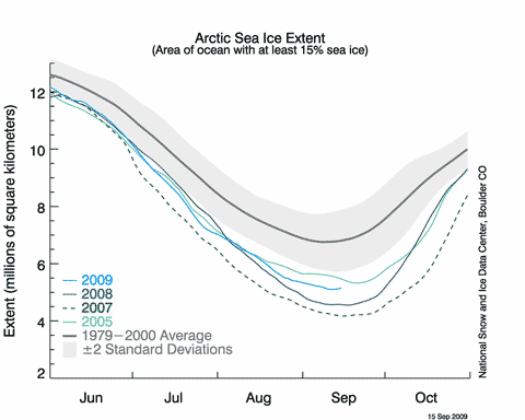
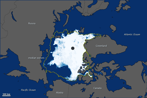
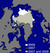
The National Snow and Ice Data Centre announced today that this year’s Arctic sea ice minimum extent was likely to have been reached on September 12. It’s the third lowest minimum in the record, behind 2007 and 2008. The image at left shows this year in white, compared with 2007 in darker colours. From the report:

On September 12, 2009 sea ice extent dropped to 5.10 million square kilometers (1.97 million square miles). This appears to have been the lowest point of the year, as sea ice has now begun its annual cycle of growth in response to autumn cooling. The 2009 minimum is the third-lowest recorded since 1979, 580,000 square kilometers (220,000 square miles) above 2008 and 970,000 square kilometers (370,000 square miles) above the record low in 2007. The 2009 minimum is 1.61 million square kilometers (620,000 square miles) below the 1979 to 2000 average minimum and 1.28 million square kilometers (490,000 square miles) below the thirty-year 1979 to 2008 average minimum.

20090917_Figure2.png

This NSIDC graph gives a very good idea of what’s been happening this year. 2009 has never looked much like beating 2007, but until mid-August it was giving 2008 a run for its money. However, a relatively cool summer and winds during August that dispersed the ice held the minimum extent above last year.

[Update 19/9] NASA’s Earth Observatory posts this graphic of the ice distribution on 12/9:

npseaice_ams_2009255.png

The usual suspects will no doubt trumpet this as a “recovery”, but the NSIDC team don’t think so:

Continue reading “Third”