
 Eli Rabett, that ever-curious but lovable lagomorph, has noticed the appearance of an apparent annual cycle in the Arctic sea ice area anomaly chart at the excellent Cryosphere Today. I mentioned the same thing in a post on Arctic sea ice back in April, and hinted that I might look at it “another day”. Well, that day has come, not least because the ice “experts” at µWatts have been suggesting it might be a satellite problem (it isn’t).
Tag: Arctic
Feel floes (gone by 2016)
 The usual suspects have been making much of the fact that over the last few weeks Arctic sea ice extent (NSIDC daily graph here) has been bumping around the 30 year average for this time of year. John Cook at Skeptical Science posted on the subject last weekend, making the important point that what matters most is not extent or area, but the total volume of ice that’s present — and that’s showing no signs of “recovery”. John’s post is well worth reading, but it set me off on a very interesting trawl through the references he provided — and drew my attention to a most useful graph of ice volume and trend. It also pointed me to research that suggests the Arctic could be effectively ice-free in summer within ten years — possibly as soon as 2013.
Wake of the flood
About 15,000 years ago the world began to warm out of the last ice age. The huge ice sheets that covered North America and Northwest Europe began to melt, and sea level began to rise. But 12,900 years before present, the climate of much of the northern hemisphere made a rapid return to full ice age conditions — cooling by as much as 10ºC. The Big Freeze, as it’s sometimes called, could have started in as little as one season. The cold snap lasted 1,300 years before warming resumed and the current interglacial began. This cooling episode is known as the Younger Dryas, because it was associated with an increase in pollen of the Arctic plant Dryas octopetala in Norwegian lake sediments.
Arctic sea ice maximum reached, melt starts
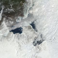
Arctic winter sea ice extent reached its maximum on March 31st, the latest date since satellite records began in 1979 according to the latest sea ice update from the National Snow and Ice Data Centre. The maximum extent was 15.25 million square kilometers. The NASA image above shows the ice extent on March 6th, before the late month growth spurt caused by a cold spell in the Bering and Barents seas. This late season ice is unlikely to have much impact on summer minimum, as it is thin and will melt rapidly as temperatures rise. Click on the image to get to a NASA animation of the winter ice season (not available on Youtube, or I would have posted it).
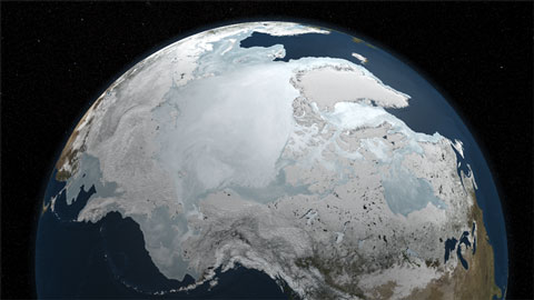
The NSIDC points out that a critical factor is the age and thickness of the ice as it heads into the summer melt season. The video below explains why, and how NASA is running a series of flights over the Arctic, the IceBridge campaign, to replace the thickness data lost with the ending of the first ICEsat mission. A new satellite won’t fly until 2013. The flights are already generating some fascinating imagery — I’ll be keeping an eye on their Twitter feed for more.
[youtube]XWYfiN7GfSY[/youtube]
Winter 2010: cold in places, exceptionally hot in others
 Northern hemisphere winter, that is — we’re still in a nice warm autumn down here. Before I disappear for a couple of days of hectic activity (vintage 2010 tomorrow, bottling the ‘09 on Monday), I just wanted to draw attention to a couple of articles I read over my Saturday morning toast (fine bread from the farmer’s market). The first is the review of the northern hemisphere winter by Bob Henson at UCAR: an interesting overview of how El Niño and the Arctic Oscillation combined to bring cold and snow to the US and Europe, but record breaking warmth to Canada, Greenland, North Africa and the Middle East. Henson draws on a fascinating statistical analysis of the winter by Geert Jan van Oldenborgh of the Netherlands Meteorological Institute(KNMI), putting the combination of cold, snow and warmth into the context of a changing climate.

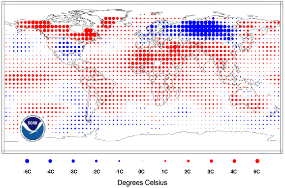
Van Oldenborgh assesses the the likelihood of the various temperature and snowfall anomalies in the context of an unchanging climate, and on the change that current trends indicate has already occurred. The map above left (click to see the original via KNMI) shows how often winters as cold as 2010 would be expected in the current (changing) climate: 10-50 year return periods are common, stretching out to 100-500 years in parts of Siberia. The map at right shows the warm extremes. Even in a warming climate, winter 2010 was a 10,000 year event — extremely unusual — in parts of the Middle East. Egypt’s winter, for instance, was a full 1ºC above the previous record, and 3ºC above the mean. Southern Greenland was also exceptionally warm. Compared with an unchanging climate (assuming that the probabilities for 1971-2000 still apply), the cold anomalies are less extreme because cold events were more common in the past, and the heat extremes were greater. But however you analyse the situation, the warmth experienced in Canada and the Middle East was more unusual than the US and European cold spells. It’s well worth reading van Oldenborgh’s article, even if you’d rather be eating chocolate eggs.
PS: Also noteworthy: David Appell takes a look at why current sea ice extent/areas don’t tell us the ice is “back to normal”, as some would have us believe. In the words of the old joke, sceptics are asserting “never mind the quality, feel the width.”
May all your buns be cross, and hot. Happy Easter.